Featured Content
Dashboard/Report design from scratch: Grid system, Information design, and Wireframe. Part 2
In this second part, we will focus on a brief introduction to Information Design and why you can consider it when designing a report or dashboard; as the first approach to this discipline, we will keep in mind that information design is about delivering complex information through effective communication with a clear visual language through a specific medium.
There are three types of information design: printed, environmental, and interactive or digital, and is the last one of our interest since our report or dashboard can be considered a digital product, and the specific means by which we deliver the information; is important to consider the means by which the information is delivered since it determines the format, size, layout, interactions, visual language and graphic elements that can be used.
Information design is about delivering complex information through effective communication with a clear visual language through a specific medium.
We first have to understand what information design is and why it is important to consider this discipline in our activity as data analysts/report designers, and we will address that by reviewing first the concept of information design and each one of its elements by considering some definitions to gain a better understanding of the term and its implications.
What is information design?
Information design is a multifaceted discipline that encompasses several key concepts:
-
Is the defining, planning, and shaping of the contents of a message and the environments in which it is presented, to satisfy the information needs of the intended recipients. (International Institute for Information Design)
-
Is concerned with the process of translating complex, unorganized, or unstructured data into valuable, meaningful information. (Society for Technical Communication)
-
Is concerned with transforming data into information, making the complex easier to understand and use.
Information design tools
The principles of information design are based on the proper use of some guidelines, techniques, or tools which we will address and are listed below:
- Grid/Structure
- Organizing information
- Hierarchy of information
- Information flow
- Visual hierarchy
- Composition
- The rhythm of design elements
- Typography and type styling
- Color
- Wayfinding elements
- Visual elements
- Visual vocabulary
- Negative space
As you can see there are many tools that we have to make the information design of our report, to cover each of these techniques or design guides in a single post would be impossible but we will be addressing and exploring each of these terms from a practical approach and its application in report design and data visualization.
The first item on that list is a tool that information design coined and we saw its use and application in the first part of this series of posts (Grid System), so our next item on the list is Organizing Information, which we will address from a practical approach aligned to report design, which is the task at hand.
Organizing information
Organizing information is the first step to structuring your report design and after all the work and time invested in the exploration, modeling, and analysis of your data, all the key information generated must be organized clearly and concisely to respond to the information users’ needs.
The purpose of organizing information in our report is to create a layout with a logical structure of information and a clear visual explanation.
Our report design is not only focused on presenting data through the appropriate language and visual vocabulary, but it is also about telling a story with data and it is in journalism, where we can take a technique or style of writing in which delivery of information is prioritized through a story structure, this technique is known as “Inverted pyramid” which presents the information in descending order of importance, in essence, the key information of the story is presented immediately and then additional information is presented to expands, explains and deepens the main story.
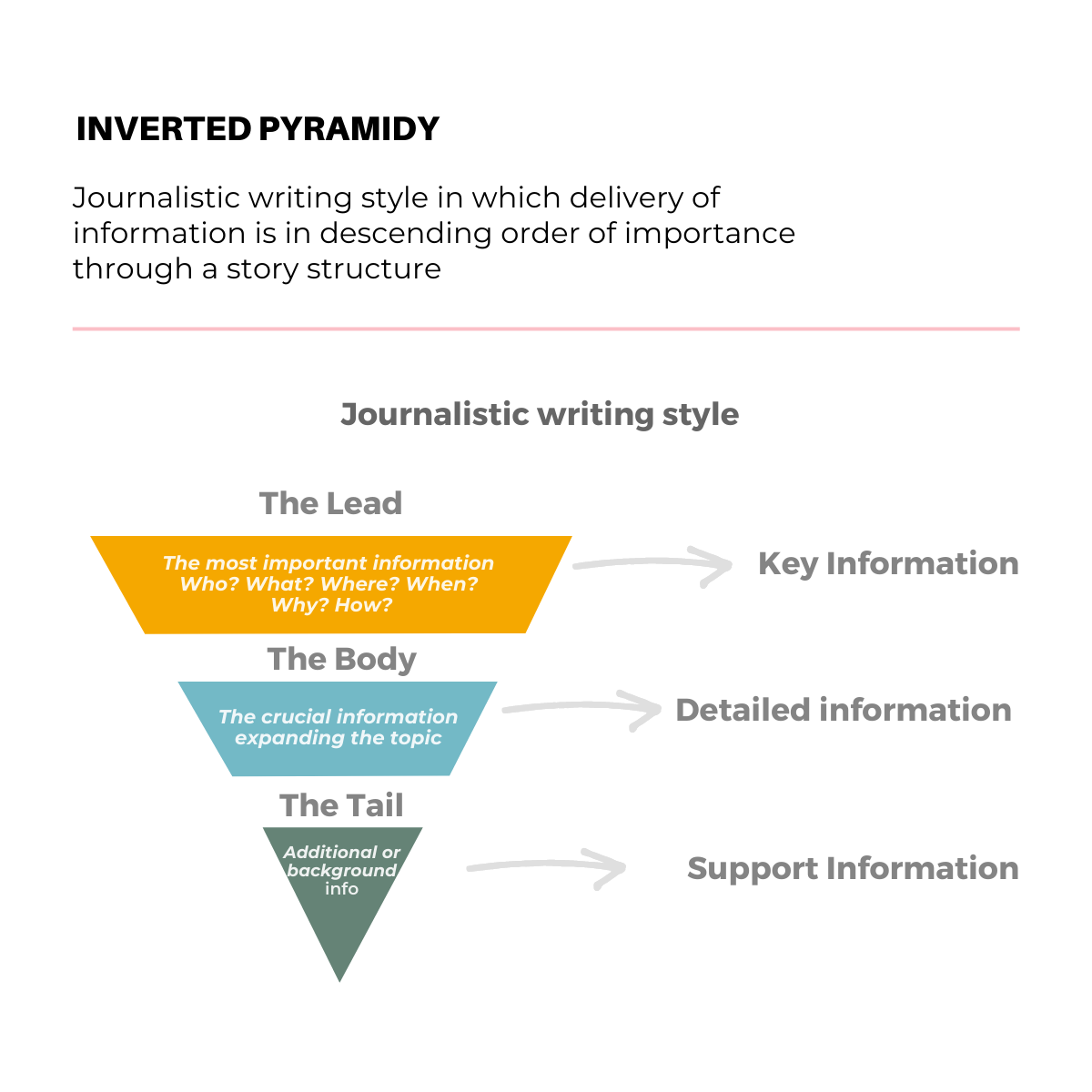 Inverted pyramid structure for information organization
From journalistic writing style to report design, we revisit a communication technique that has been used in the past for many years to adapt it and transform an inverted pyramid into two basic layouts with a logical structure for organizing information in our report or dashboard.
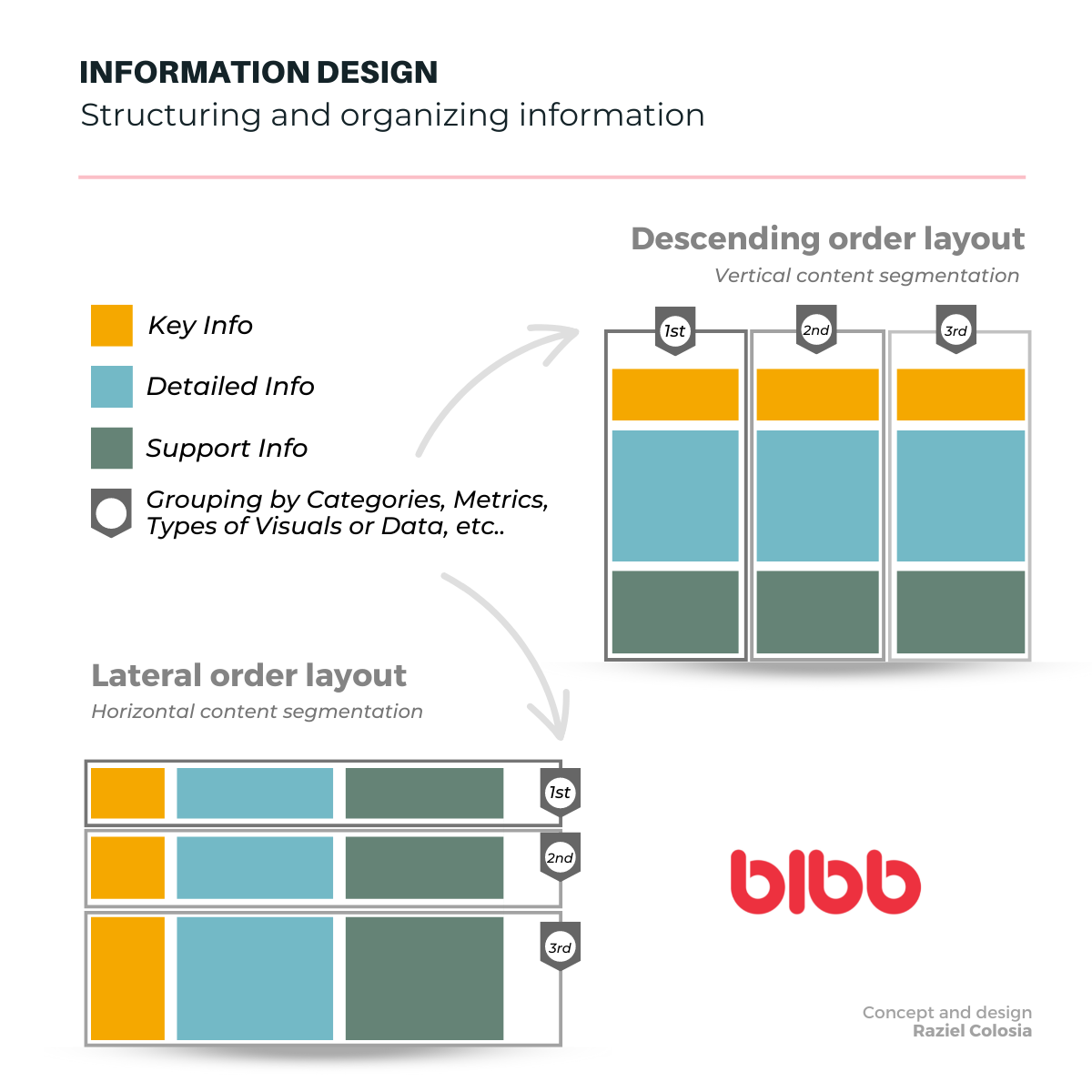 Information design layout structures for dashboard organization
The previous image proposes a structure and organization of information in two very functional layouts in which you can develop your report design, the first layout presents the information in descending order of importance and the second is in lateral order of advance from left to right, and propose vertically content segmentation in the first disposition and horizontally in the second one, this segmentation obeys to establish a logical structure of information, to deliver complex information in an easy way to understand and generates specific knowledge about a particular fact in our data.
Key questions for organizing your data
The creation of a report has the objective of answering specific questions according to the information needs of the consumers of the report and it is necessary an organized, hierarchical presentation focused on the most relevant data, that allows at a first glance to have a general idea and that the arrangement of the information and report design itself generate curiosity about what else can data reveal.
In addition to the explicit information requirements that gave origin to your report, the following questions can serve as a guide to organizing your data:
- What information does the user need to see first?
- What information does the user need to see the second and third?
- What layout best suits my data?
- Which visuals best represent each type of data?
- Which visuals and how many do I need to use in my report?
- Which is the best layout for grouping information?
- Which criteria is best for grouping blocks of information?
The importance of design in business intelligence
It is just left for me to share with you that writing this brief introduction to Information Design led me to think that just as we develop oral and written communication skills, it is important for data visualization and report design not only the knowledge of a business intelligence tool but also to develop graphic and visual communication skills since Design Matters and Design Drives Business Intelligence.
Like good writing, good graphical displays of data communicate ideas with clarity, precision, and efficiency. — Michael Friendly
This approach to information design will help you create more effective dashboards that not only present data but tell compelling stories that drive business decisions and user engagement.







Comments
Share your take or ask a question below.