Featured Content

AI Agent Skills: Stop Paying for Tokens You Don't Need
AI agent Skills replace bloated instruction files with on-demand context loading — cutting token waste by 80% for Excel and Power Query workflows.
AI Agent Skills: Stop Paying for Tokens You Don't Need
AI agent Skills replace bloated instruction files with on-demand context loading — cutting token waste by 80% for Excel and Power Query workflows.

KPI Tree for Performance Management: A Visual 7-Step Guide
KPI Tree for Performance Management: a practical 7-step method to align strategy with KPIs, cut metric overload, and create dashboards people actually use.

Why Your BI Team Needs a Product Mindset, Not Just Reports
Discover why developing a BI team product mindset is essential for building compounding value. Learn how to shift from reactive reporting to strategic product thinking.
DAX and UDF SVG Charts in Power BI: Complete Guide
Learn to build DAX and UDF SVG charts in Power BI with this complete guide. Create custom visualizations using pure DAX code with dynamic scaling and conditional formatting.

DAX + UDF = the React of Power BI
Learn how to combine Power BI DAX user-defined functions with HTML visuals to build reusable KPI cards, tables, and progress bars that wow report stakeholders.

Automating Power BI Themes with Fabric, Notebooks and BIBB Theme Generator API: A Complete Guide
Learn how to automate Power BI report theme updates using Microsoft Fabric, Python, and the BIBB Theme Generator API for seamless theme management.

What is a Template in Power BI? Settling the debate.
Understand what each Power BI Template type does, when to use it, and how it shapes the user experience.

Improving BI User Experience in Corporate Environments: Practical Strategies That Work
Discover actionable techniques for improving BI user experience in corporate environments, focusing on user personas, training, and documentation.

Data Exfiltration in Power Query - Understanding the Risk and Protections
Data Exfiltration in Power Query: Understanding the Risk and Protections

Automation of the 'Meet the Team' PDF Slides with Power BI
Automate 'Meet the Team' PDF slides using Power BI, SharePoint, and Power Automate to save time, ensure consistency, and scale across proposals.
Dashboard/Report design from scratch: Grid System, Information Design, and Wireframes - part 1

The first thing to keep in mind when you start designing your report or dashboard is that you don’t need to start from scratch, you can adapt other concepts or tools from other disciplines to facilitate and improve by far the final result of your design or any process in your data analytics project.
Throughout this post series, I will introduce and apply three necessary concepts you should consider when designing your next reports: Grid system, Information design, and Wireframes.
You don’t need to start from scratch, you can adapt concepts or tools from other disciplines.
Key concepts to keep in mind
A grid is a structure composed of the intersection of horizontal and vertical axes that enable the means to position and organize visual elements and provide order and unity in a compositional layout.
If you want to know the basics of Grid Systems you must read this post to get into the subject:
Designing with structure
The objective of adopting and applying the grid system is to have a framework that provides us with a flexible structure for our design and, in particular, to achieve an adequate organization and position of all the visual and graphic elements that make up a report or dashboard.
The canvas is where we integrate all the design elements, but the grid is the means to position and contain them properly.
Starting to develop the design of your report on the Power BI canvas in my opinion is not the best option, because this way it becomes a trial and error exercise that consumes too much time, as it is developed on the fly without any previous exercise or sketch, when in fact there are other options or tools to perform this exercise.
The first place where we can find a structure for the design is in the Grid System, and importing this tool into the Power BI canvas will pay off in a better design, organization, and placement of each graphical element and visual object in our report, resulting in a cohesive and clear design.
Each design problem is different and, therefore, requires a grid system that responds to its specific needs, in our case reports/dashboards design for data analysis; as report designers, I believe that we can consider and find new ways to apply the grid system, so my approach to design a report or dashboard is the use of the Modular grid.
The key is to have a structure to start your design.
Modular Grid
Is a framework of modules created by the intersection of multiple columns and horizontal flowlines that forms distinct fields or spatial zones by activating and combining horizontally or vertically these modules.
How to start to used Grid System
We have already talked enough about the grid system, so now it is time to start applying it in our design process of reports/dashboards.
Personally, I like to work with Adobe Illustrator in every new report design, so the next step is to build a grid that considers each element to be used in the report and to be flexible to allow different design possibilities for grouping modules to form spatial zones and columns required by our content (visual objects and graphics) and then import it into Power BI.
Considering the canvas size and looking to count suitable Margins, Flow-lines, Gutter, and Negative space, the best fit is provided by a 40*40 px module size, resulting in a grid of 13 * 23 modules that provide great versatility and several design layouts, since, with this configuration and measures, this modular grid allows basic layout options for navigation using horizontal bars at the top of the grid as well as horizontal bars on the left side of the grid; the following image shows the modular grid construction in adobe illustrator
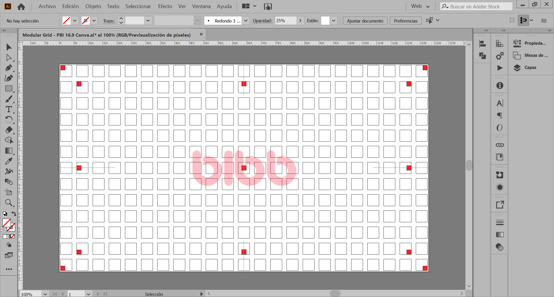 Modular grid construction in Adobe Illustrator
Practical Implementation
Maybe Illustrator is not the tool you normally use but it is not a limitation to applying the grid system, we can import this image and use it as a background in PowerPoint or any other tool, in which you can start to draw the first design ideas, organize and placing the basic shapes that represent the visual objects and other elements to be used in your report/dashboards.
The Sketch and its development, as well as the Wireframe, were made in Illustrator (I think it would be a good idea to make a post about the creative process) so after trying some options and defining the direction of the design, the result can be seen in the following image in which I made the first version of my next report.
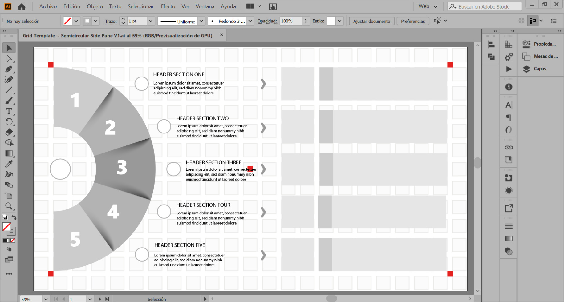 Dashboard sketch showing grid system application
This sketch of my report is the result of integrating into my design process the grid system, (a topic already covered in this post) and two other frameworks or tools: Design information, and Wireframes; which we will see in the following posts, Meanwhile you can subscribe and download the modular grid template to start working.
Using the Grid in Power BI
Once you have the template you can place it as a background in the Power BI canvas, by going to the Visualizations pane > Canvas Background > Image, once you select the template image make the following adjustments in Image Fit > Fit and reduce the transparency percentage, then to take advantage of the smart guides you can place 4 squares of 40 x 40 px in each corner of the canvas, to set a proper margin for your report, either for navigation bars or any other function or information you require in the layout of your design.
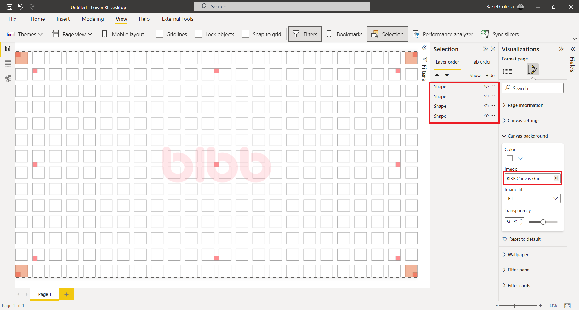 Modular grid implemented as background in Power BI canvas
Key takeaways
The grid system is an aid, not a guarantee. It permits a number of possible uses and each designer can look for a solution appropriate to their own personal style. But one must learn how to use the grid; it is an art that requires practice. — Josef Muller-Brockmann
I hope this post can provide a clearer idea of what a grid system is and how to start using it in your next reports, I think it is a good time to start learning how to use grids and develop your design style through the use and practice of this tool.
See you in the second part of this series: Dashboard/Report design from scratch: Grid Systems, Information Design, and Wireframes - Part 2
Comments
Share your take or ask a question below.