Featured Content

AI Agent Skills: Stop Paying for Tokens You Don't Need
AI agent Skills replace bloated instruction files with on-demand context loading — cutting token waste by 80% for Excel and Power Query workflows.
AI Agent Skills: Stop Paying for Tokens You Don't Need
AI agent Skills replace bloated instruction files with on-demand context loading — cutting token waste by 80% for Excel and Power Query workflows.

KPI Tree for Performance Management: A Visual 7-Step Guide
KPI Tree for Performance Management: a practical 7-step method to align strategy with KPIs, cut metric overload, and create dashboards people actually use.

Why Your BI Team Needs a Product Mindset, Not Just Reports
Discover why developing a BI team product mindset is essential for building compounding value. Learn how to shift from reactive reporting to strategic product thinking.
DAX and UDF SVG Charts in Power BI: Complete Guide
Learn to build DAX and UDF SVG charts in Power BI with this complete guide. Create custom visualizations using pure DAX code with dynamic scaling and conditional formatting.

DAX + UDF = the React of Power BI
Learn how to combine Power BI DAX user-defined functions with HTML visuals to build reusable KPI cards, tables, and progress bars that wow report stakeholders.

Automating Power BI Themes with Fabric, Notebooks and BIBB Theme Generator API: A Complete Guide
Learn how to automate Power BI report theme updates using Microsoft Fabric, Python, and the BIBB Theme Generator API for seamless theme management.

What is a Template in Power BI? Settling the debate.
Understand what each Power BI Template type does, when to use it, and how it shapes the user experience.

Improving BI User Experience in Corporate Environments: Practical Strategies That Work
Discover actionable techniques for improving BI user experience in corporate environments, focusing on user personas, training, and documentation.

Data Exfiltration in Power Query - Understanding the Risk and Protections
Data Exfiltration in Power Query: Understanding the Risk and Protections

Automation of the 'Meet the Team' PDF Slides with Power BI
Automate 'Meet the Team' PDF slides using Power BI, SharePoint, and Power Automate to save time, ensure consistency, and scale across proposals.
Dynamic Heatmap Selection: Enhancing Dashboard Interaction and User Experience

Exploring the Impact of Heatmap Dashboard User Experience on Business Intelligence and User Engagement
In enhancing the heatmap dashboard user experience, we utilize heatmaps to transform mere numerical data into engaging visualizations by highlighting table or matrix cells. This technique emphasizes high and low values with vibrant colours. However, applying a gradient to numerous columns, though valuable, can overwhelm the user, making it difficult to focus as colours dominate the view.
Another problem arises when users select the same measure or field in other visuals. You may want only the heatmap of that measure in the table to be visible and focused, but nothing happens. By default, all columns end up coloured.
To improve the heatmap dashboard user experience, we plan to address these visualization challenges by enabling dynamic selection and highlighting heatmaps within the tables. The intended result allows users to select a measure or value, automatically highlighting the corresponding heatmap for better visibility and interaction.
 Dynamically selecting heatmaps in a table by slicer
Scenario
We want to create a dashboard displaying sales or other metrics to see how segment items perform across different dimensions. Additionally, we have a table where we’ve coloured the cells by a gradient to resemble a heatmap. We aim for this functionality: when a segment is selected, the related items in other visuals are highlighted, and in the table, only two columns display a heatmap for better comparison—the sales value column and the percentage of sales for the selected segment. By selecting different segment items, the heatmap related to that item is highlighted and visible for comparison with the sales column heatmap.
This approach provides the best functionality for users to interact with the dashboard, helping them focus on related items in the table for better comparison.
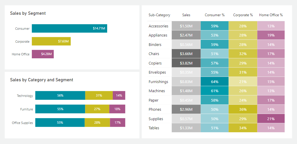 Default state, nothing selected
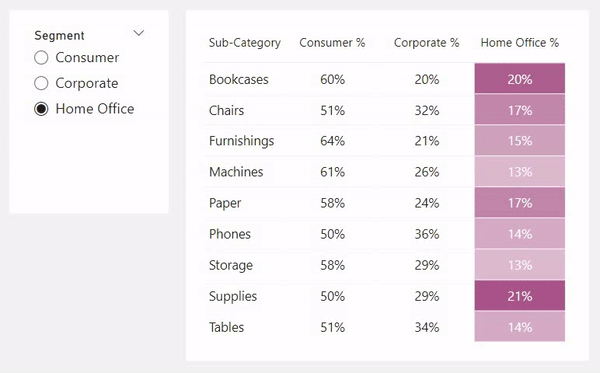
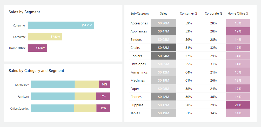 Home office segment is selected and the related heatmap is visible
But first, let’s try how we can normally create a heatmap, which doesn’t involve the interactivity of highlighting by selection.
Cell Elements, Background Colour
To highlight cells of a table or matrix visual using a gradient, we must navigate to the “Cell elements” section of the visual’s formatting. Then, we can enable the background colour option.
Typically, the gradient option is pre-selected for creating a heatmap, which is our focus to enhance the heatmap dashboard user experience. Assigning colours to represent the minimum and maximum values and finalizing with the ‘OK’ button generates a heatmap for that specific column. Yet, this method lacks dynamics in selection, an area we aim to improve.
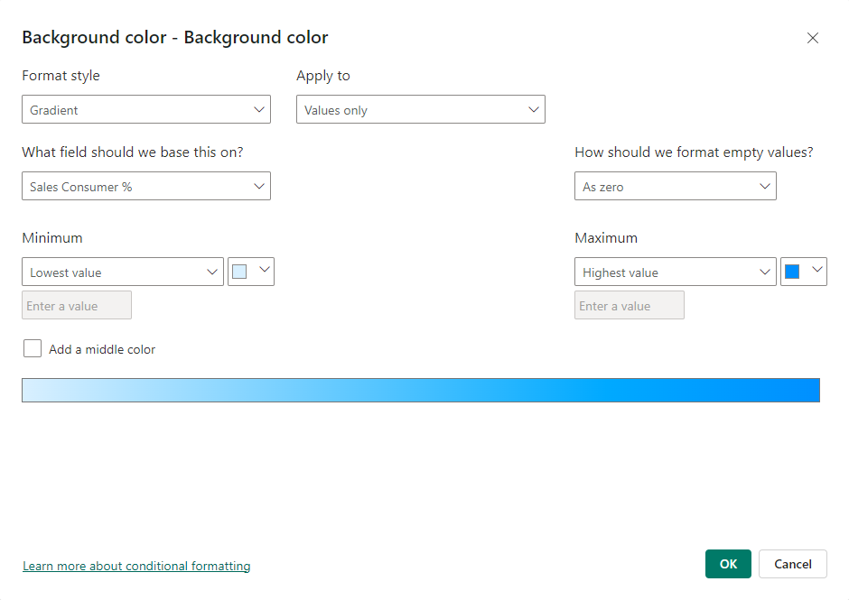 Default gradient option for background colour
Formatting Empty Values
In the gradient style of background colour formatting, there is also an option to format empty values with a specific colour. Another option is to colour cells based on another measure or field rather than the cell values themselves.
So, we can leverage these options and create a measure that returns empty (blank) values when the related item is not selected. When selected, it returns the value of the cells, and we format this measure to colour empty values the same colour as the background (which here is white). First, we must write the measure to return blank when the item is not selected.
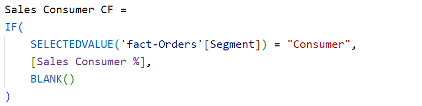 Returning Blank values when the segment is not selected
So, in the formatting settings of the background colour, change the measure on which the gradient will be based. Also, set the settings for how the empty values should be formatted from “Don’t format” to “Specific Colour” and choose the white colour or the colour you used for the background of the table visual.
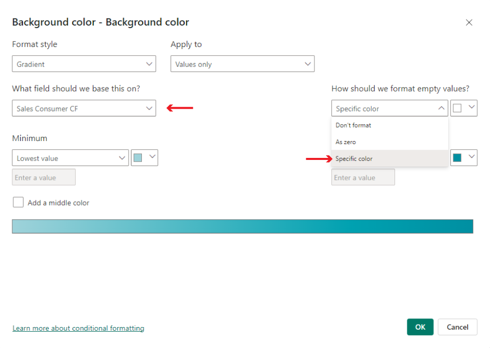 Colouring based on the new measure and formatting empty values by background colour
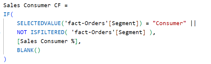
In the measure, you can also not specify BLANK() in the else statement of the IF function because, by default, it will return BLANK() if we don’t specify a value.
With this approach, the gradient will only be visible when the user selects and filters the segment. If it’s not selected, it will return the background colour for all of the cells.
Default State
We can also change the default state when the segment is not selected to show the heatmap for all columns, and only when a segment is selected to show the heatmap only for that column to be in focus mode.
The only thing we have to adjust is the code for colouring the background so that the actual value is shown even when nothing is filtered from the segment column. When it is selected, show a blank or empty value, which will be formatted as white.
 Returning actual values also when nothing is selected
The advantage of this approach is that the user can first overview the heatmap by selecting from a slicer or other visuals; the related column will be highlighted and stand out from the rest.
In the scenario, when we select a segment, the related value will be highlighted in other visuals. Still, nothing happens in the table if we don’t apply this colour functionality. So, while the other visuals are highlighted, it’s a better user experience if the related value in the table is also highlighted and stands out.
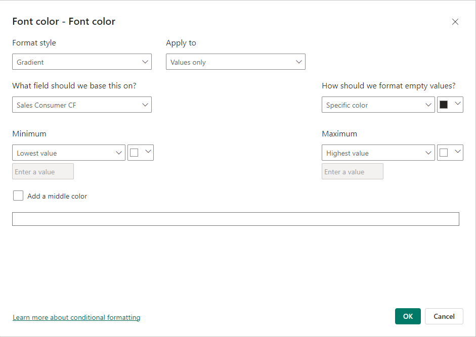
Font Colour
Font Colour
Using the same measures, we can change the font colour of values so that when the segment is selected, not only will the heatmap of that segment pop up, but also the font colour will be white to be more readable on the colourful background. This choice is relatively dependent on your background colour choices, but it will improve readability if we have two states for the font colour: when the gradient background is on and when it is not.
To do this, again, below the settings for colour conditional formatting for the background, we can turn on the settings for the font colour. Change the field that the gradient will be based on from the actual value to the one we made to return blank values when the segment is not selected. So when it is not selected, format the empty values with black, and when it is selected, which will show the gradient, choose white for the min and max values.
With this approach, if the background gradient goes from a light colour to a dark one, then the white colour for the font will make the high values more visible and stand out.
 Changing the font colour when the segment is selected
Conclusion
The ability to select specific columns within a table or matrix visual to be coloured with a gradient and make a heatmap is a functionality that helps the user focus on that specific column. In another scenario, when we have a heatmap for one column and want to compare it with others, giving this option to select which column shows a heatmap makes comparisons much easier than when all columns have a gradient background.
Also, it makes the matrix and table visuals more synchronized with other visuals on a page, allowing users to interact more with other visuals by selection. All of these improvements enhance the user experience when interacting with the dashboard and provide clarity for communicating insights.
Comments
Share your take or ask a question below.