Featured Content

AI Agent Skills: Stop Paying for Tokens You Don't Need
AI agent Skills replace bloated instruction files with on-demand context loading — cutting token waste by 80% for Excel and Power Query workflows.
AI Agent Skills: Stop Paying for Tokens You Don't Need
AI agent Skills replace bloated instruction files with on-demand context loading — cutting token waste by 80% for Excel and Power Query workflows.

KPI Tree for Performance Management: A Visual 7-Step Guide
KPI Tree for Performance Management: a practical 7-step method to align strategy with KPIs, cut metric overload, and create dashboards people actually use.

Why Your BI Team Needs a Product Mindset, Not Just Reports
Discover why developing a BI team product mindset is essential for building compounding value. Learn how to shift from reactive reporting to strategic product thinking.

DAX and UDF SVG Charts in Power BI: Complete Guide
Learn to build DAX and UDF SVG charts in Power BI with this complete guide. Create custom visualizations using pure DAX code with dynamic scaling and conditional formatting.

DAX + UDF = the React of Power BI
Learn how to combine Power BI DAX user-defined functions with HTML visuals to build reusable KPI cards, tables, and progress bars that wow report stakeholders.

Automating Power BI Themes with Fabric, Notebooks and BIBB Theme Generator API: A Complete Guide
Learn how to automate Power BI report theme updates using Microsoft Fabric, Python, and the BIBB Theme Generator API for seamless theme management.

What is a Template in Power BI? Settling the debate.
Understand what each Power BI Template type does, when to use it, and how it shapes the user experience.
Improving BI User Experience in Corporate Environments: Practical Strategies That Work
Discover actionable techniques for improving BI user experience in corporate environments, focusing on user personas, training, and documentation.

Data Exfiltration in Power Query - Understanding the Risk and Protections
Data Exfiltration in Power Query: Understanding the Risk and Protections

Automation of the 'Meet the Team' PDF Slides with Power BI
Automate 'Meet the Team' PDF slides using Power BI, SharePoint, and Power Automate to save time, ensure consistency, and scale across proposals.
Learn How Startups Can Harness Power BI and User-Centred Design for Impactful Dashboards

Discover how Startups Power BI User-Centred Design transforms raw data into actionable insights, improving decision-making and business success.
 I believe every startup needs a dashboard that not only tracks numbers but tells a story.
The difference between a startup’s success and failure often hinges on how effectively they implement Startup Power BI User-Centred Design to transform raw data into actionable insights. Many startups gather large amounts of data, but the real challenge is presenting it clearly to support informed decision-making. This is where the synergy between Power BI and user-centered design becomes invaluable.
According to Forrester Research (2023), organizations that effectively employ data visualization tools experience a 32% boost in decision-making speed and a 28% increase in data accuracy. Additionally, McKinsey’s most recent study (2023) found that data-driven businesses are 23% more likely to attract consumers and 19% more likely to be profitable.
However, merely adopting a business intelligence tool is insufficient; the key is in creating dashboards that meet users’ demands and provide relevant insights.
The Foundation: Understanding User-Centered Dashboard Design
Comprehensive User Research
Startups aiming to master Startup Power BI User-Centered Design must begin with comprehensive user research.
Stakeholder Interviews
- Understand specific goals and pain points
- Identify key metrics and KPIs
- Define success criteria
- Document reporting frequencies
User Personas Development
- Executive Level: Needs high-level strategic insights
- Operations Team: Requires detailed daily metrics
- Sales Team: Focuses on pipeline and conversion data
- Marketing Team: Tracks campaign performance
- Product Team: Monitors user engagement metrics
Organizing Data Structure
Organize your data structure based on the following:
- Business objectives
- User workflows
- Data relationships
- Access requirements
- Update frequencies
Design Principles for Maximum Impact
Visual Hierarchy
- Place crucial information in prime viewing areas
- Use size and color to indicate importance
- Implement consistent spacing
- Create clear visual pathways
Color Psychology
- Use brand colors appropriately
- Use colors for meaning (red for alerts, green for success)
- Ensure accessibility for color-blind users
- Maintain consistent color coding
Building Effective Dashboards in Power BI
 Power BI helps businesses streamline data into clear, actionable insights—making decision-making faster, easier, and more confident.
Strategic Planning Phase
Before opening Power BI, develop:
- Clear dashboard objectives
- Key metric requirements
- Data source mapping
- Update frequency plans
- Security requirements
Layout Best Practices
Page Structure
- Overview page for high-level metrics
- Detailed pages for specific areas
- Drill-through pages for deep understanding
- Filter panels for customization
Visual Organization
- Group related metrics together
- Implement consistent spacing
- Use grid alignment
- Maintain visual balance
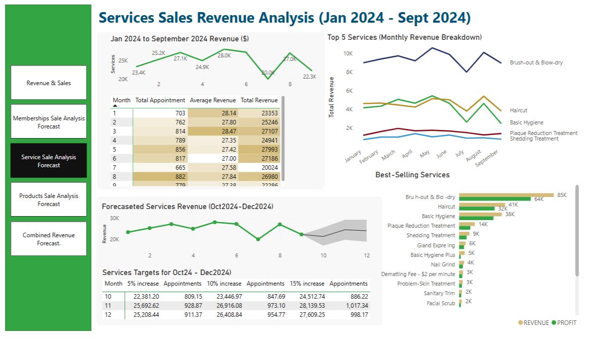
Visual Selection Guidelines
Choose appropriate visualizations based on data type:
Comparison Data
- Bar charts for static comparisons
- Column charts for time-based comparisons
- Bullet charts for targets vs. actuals
Trend Analysis
- Line charts for continuous data
- Area charts for cumulative trends
- Sparklines for quick trends
Part-to-Whole Relationships
- Use pie charts sparingly
- Treemaps for hierarchical data
- Stacked bars for component analysis
Interactive Design Elements
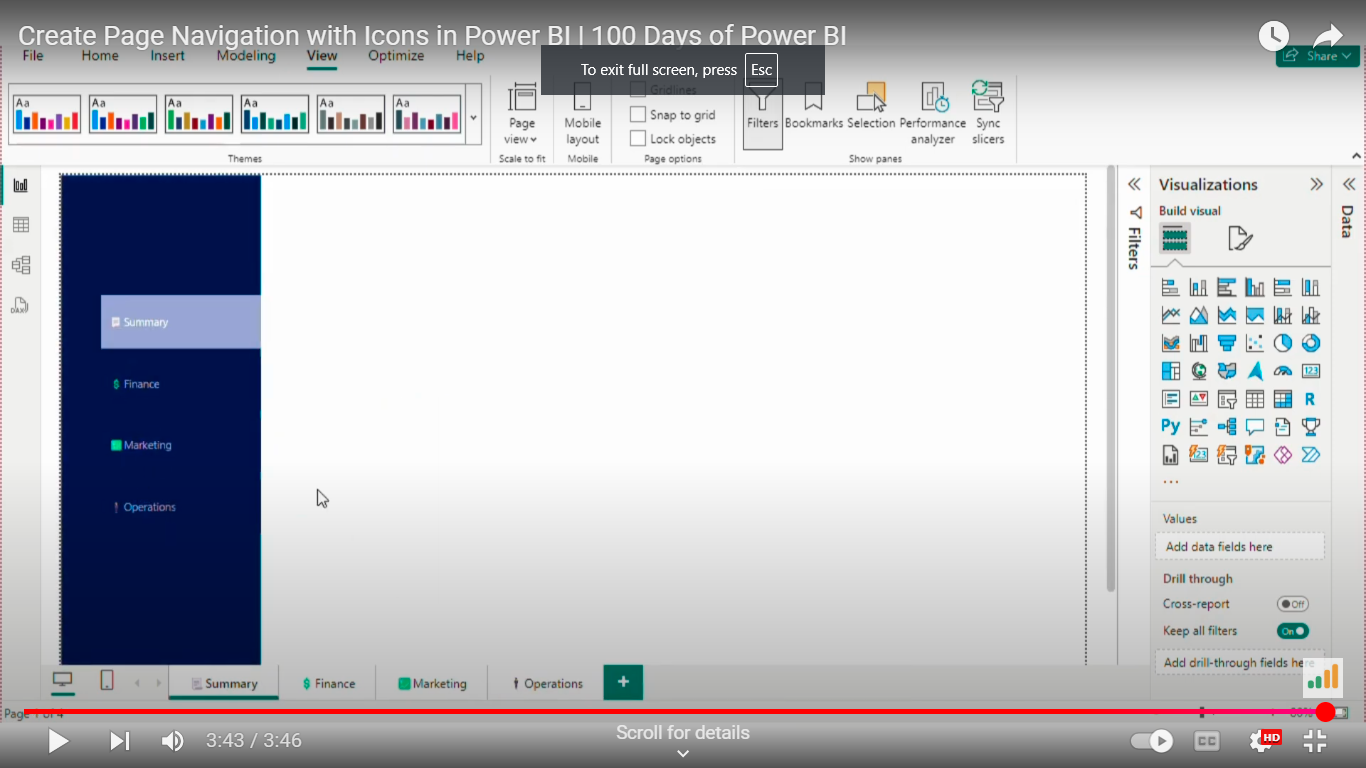 Create Page Navigation with Icons in Power BI.
Navigation Framework
Clear Menu Structure
- Logical page hierarchy
- Consistent navigation patterns
- Breadcrumb trails
- Quick access to key pages
Filter Design
- Global filters for cross-page analysis
- Page-level filters for specific views
- Cascading filters for detailed analysis
- Clear filter state indicators
User Interaction Features
Drill-Down Capabilities
- Hierarchical navigation
- Context-preserving transitions
- Back-navigation options
- Clear drill-path indicators
Custom Tooltips
- Relevant additional information
- Contextual insights
- Related metrics
- Action triggers
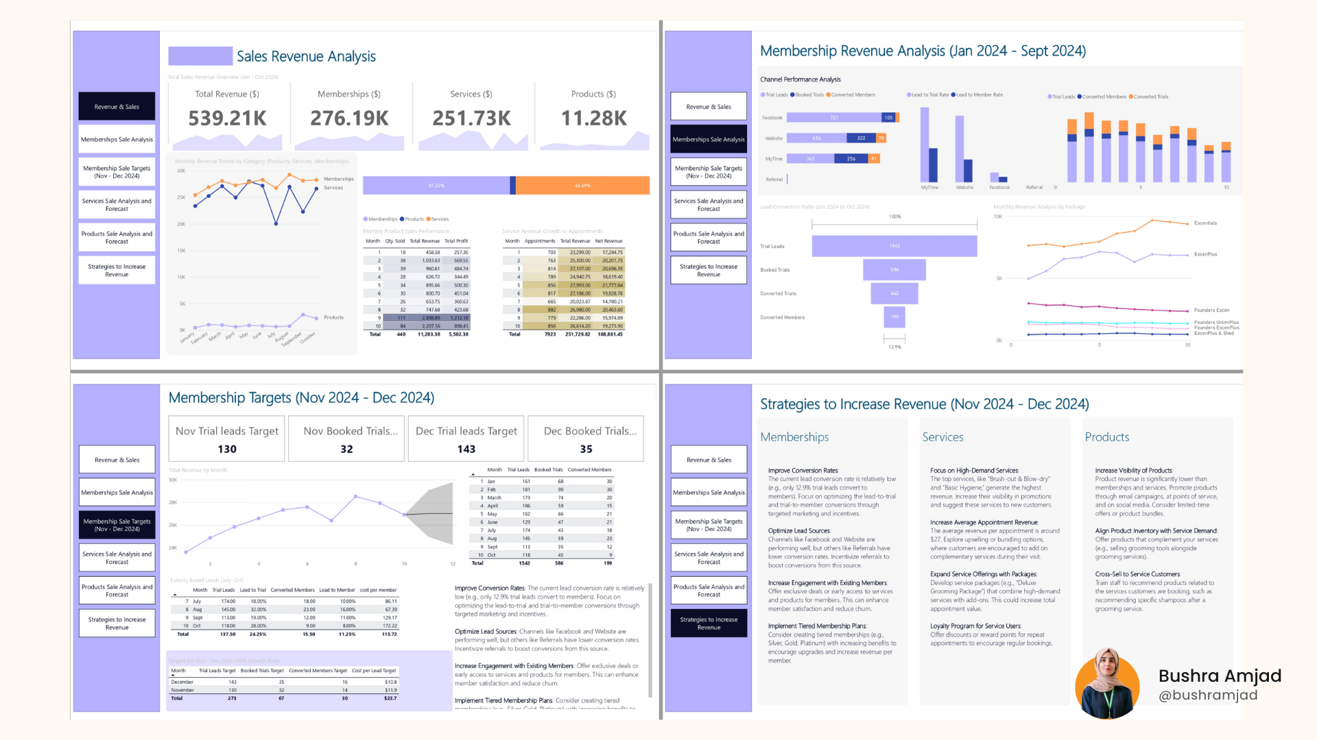
Case Study: E-commerce Dashboard Transformation
An emerging e-commerce firm with over 50 workers and $5 million in yearly revenue faced challenges that could be addressed through Startup Power BI User-Centered Design, including data fragmentation and delayed decision-making.
Initial Challenges
- Data scattered across seven different platforms
- 4-5 hours spent weekly on manual reporting
- A 20% error rate in manual data compilation
- Low user adoption of existing dashboards (15%)
Solution Implementation
1. Discovery Phase
- Conducted 5+ user interviews
- Created four distinct user personas
- Mapped 15 critical business processes
- Identified 30 essential metrics
2. Dashboard Development
Executive Dashboard
- Daily sales overview with hourly updates
- Inventory health metrics
- Customer satisfaction scores
- Financial performance indicators
Operations Dashboard
- Real-time inventory levels
- Order fulfillment metrics
- Supply chain visibility
- Warehouse performance
Customer Insights Dashboard
- Customer behavior patterns
- Purchase history analysis
- Customer satisfaction trends
- Return rate monitoring
Measurable Results
- 40% reduction in reporting time
- 25% improvement in inventory management
- 30% increase in dashboard user adoption
- 95% user satisfaction rate
- 50% faster decision-making process
Best Practices for Sustainable Success
Performance Optimization
Data Refresh Strategy
- Implement incremental refreshes
- Schedule updates during off-peak hours
- Monitor refresh success rates
- Optimize semantic models
Regular Maintenance
- Weekly performance checks
- Monthly user feedback reviews
- Quarterly feature updates
- Annual comprehensive review
User Adoption Strategy
Training Program
- Initial onboarding sessions
- Regular workshop sessions
- Video tutorials
- Quick reference guides
Support Structure
- Dedicated support channel
- FAQ documentation
- User feedback system
- Regular check-ins
Common Pitfalls and Solutions
Design Mistakes
- Overcrowding pages with too many visuals
- Using inappropriate chart types
- Inconsistent formatting
- Poor mobile optimization
Technical Issues
- Slow refresh rates
- Complex semantic models
- Insufficient testing
- Poor documentation
User Experience Problems
- Confusing navigation
- Insufficient user training
- Lack of context
- Poor feedback implementation
Future-Proofing Your Dashboards
Scalability Considerations
- Plan for data growth
- Consider additional user types
- Allow for metric evolution
- Build flexible layouts
Technology Integration
- API connectivity options
- Cross-platform compatibility
- Mobile responsiveness
- Security updates
Conclusion
Creating effective dashboards is an iterative process that requires a thorough understanding of technical capabilities and user requirements.
Success comes from:
- Thorough user research and comprehension
- Careful planning and design
- Regular feedback and iteration
- Focus on simplicity and clarity
- Commitment to Continuous Improvement
Remember, even the most complex dashboard is only as effective as its capacity to drive actions and decisions. By adhering to these principles and rules, startups may design Power BI dashboards that appear professional and become crucial tools for business success.
The idea is to begin with user needs, build with purpose, and iterate based on feedback and evolving business requirements. By adopting this technique, your Power BI dashboards will be a key driver of your startup’s growth and success.
Comments
Share your take or ask a question below.