
Maps can be great tools in Power BI to help visualize data. For example, you could use a map to visualize sales data by region. Maps can help you see where your business is doing well and where it could improve.
Still, I often find maps troubling; It is not that I always recommend using maps; there are some cases when maps should not be used in analytics and business intelligence; maps can be misleading, they can become messy, and probably you don't need them. Before inserting a map into your Business Intelligence report, you should ask: do I need a map?
You have decided that you need a map; today, I will show you an approach that has worked for me in my analytics report: a map with two versions: 3D and a flat.
Why have two versions of maps in a single Power BI report? The answer is simple: each version has its pros and drawbacks, but one complements the other.
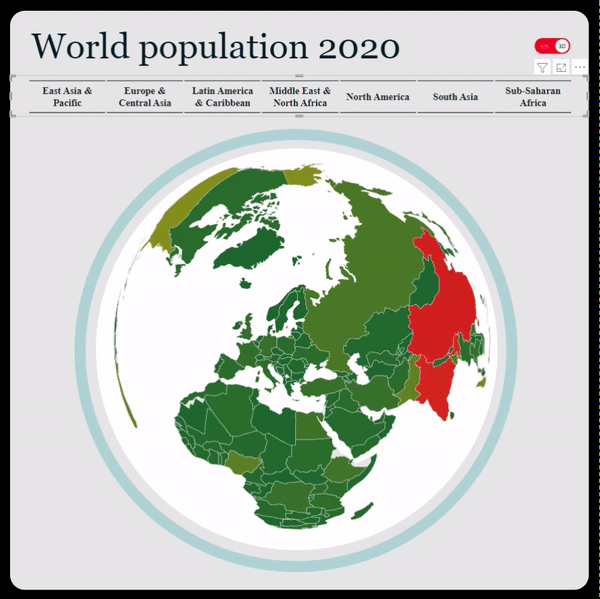
The 3D version
I believe the visual's effect when selecting different countries or regions is fantastic, but it comes with a significant drawback: you cannot see all the nations of the world simultaneously; in its neutral display, the maps miss substantial parts of the works as Latin America and Australia.
The first time I saw the 3d version of this map, I was presented by Will Thompson. This visualization is a Shape map created with TopoJson format.
If you want to use this map, there are two routes: copy and paste the visual or extract the JSON file from the PBIX file; for extracting the JSON file, you must change the file's extension from *.PBIX to *.ZIP and navigate to the folder "Registered Resources."
Creating a lovely version of this 3D map can be challenging; you might need additional elements and shapes to make it look more natural. I believe the extra effort pays off.
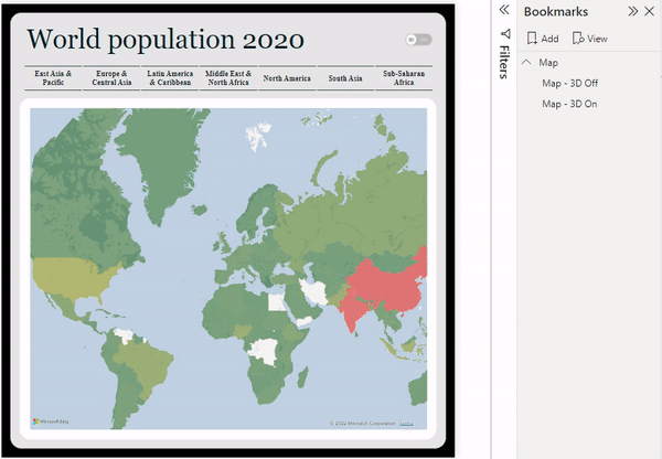
The flat map
Contrary to the shape map, this map has a more traditional look; there are no fantastic effects. This map has its efficacy in simplicity: people are used to this map's projection, and you can visualize the whole world in its neutral state.
The flat map uses the traditional "Filled map"; no magic here 🤣.

The transition
A toggle button does the transition between the two maps. The switch, which is an image, activates a bookmark where we hide and unhide the different versions.
You need to consider that for making these bookmarks; you need to unselect the "Data" and select the "Selected visuals" option of the bookmark.
Grouping different elements come in handy when working with bookmarks; the reason is that it is simpler to select a group rather than many elements.
Putting everything together, we can have two versions of the map, one complementing the other; we give the user the ability to choose the version they like the most or the one they find more beneficial for their analysis.
I would love to hear from you. What do you think of these maps?
Comments