Featured Content
Review of The Data Storyteller's Handbook: How to Create Business Impact Using Data Storytelling by Kat Greenbrook
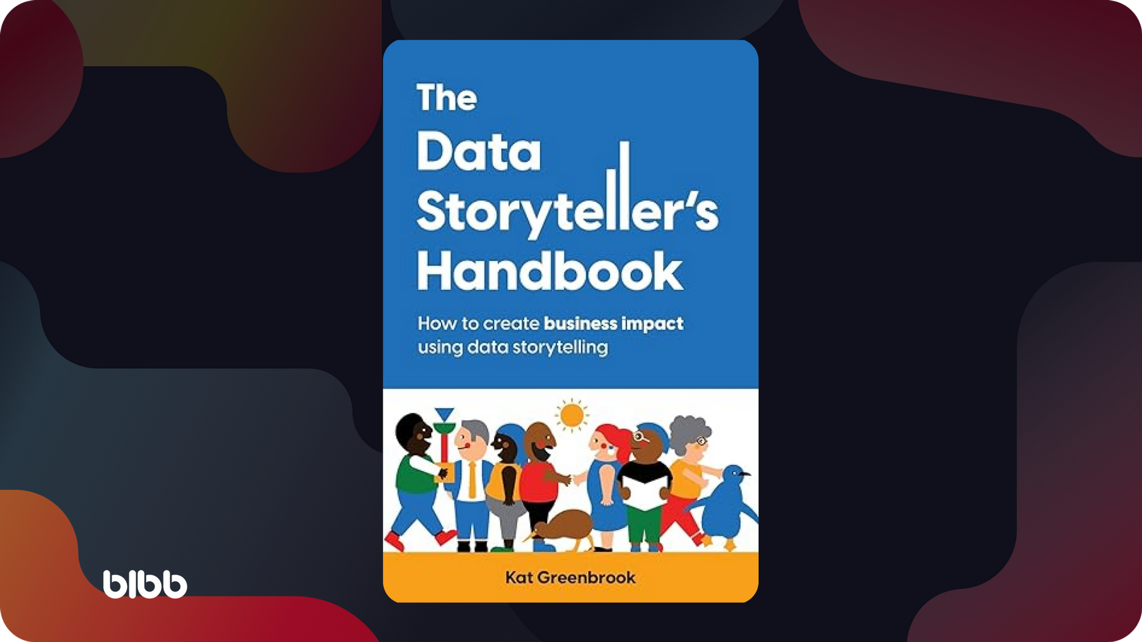 Review: The Data Storyteller’s Handbook
Summary
The Data Storyteller’s Handbook Review by Kat Greenbrook reveals a comprehensive guide tailored for professionals who aim to leverage data storytelling to create significant business impact. The book is divided into two primary sections: the first four chapters provide foundational knowledge on data visualization, while the last three delve into the nuances of data storytelling.
The book is an excellent resource for those new to data storytelling or looking to refine their skills, though it may be less functional for those already well-versed in advanced data storytelling techniques.
Audience
The book serves as a practical guide for a variety of professionals by bridging the gap between data analysis and impactful storytelling. This makes it particularly useful for business intelligence professionals, data analysts, and other data-intensive roles where clear communication of data-driven insights is crucial.
For Whom This Book Is
Business Intelligence (BI) Professionals: Those focused on enhancing user experience (UX) with data storytelling techniques.
Data Analysts and Data Scientists: Individuals seeking to communicate their findings more effectively.
Other Data-Intensive Professionals: Those looking to use data-driven storytelling to enhance their strategies and present data to diverse stakeholders.
For Whom This Book Isn't
Advanced Data Storytellers: Experts in the field might find the foundational chapters redundant.
Dashboard Designers: The book does not provide specific guidance on designing dashboards, as it explicitly states.
Content Breakdown
The handbook is structured into seven chapters, which I believe can be further grouped into two main sections: Foundational Knowledge and Data Storytelling Techniques. This organization allows readers to first build a solid foundation in data visualization before moving on to the more intricate aspects of data storytelling.
Foundational Knowledge (Chapters 1-4)
Why Visualize Your Data?: Explores fundamental reasons for data visualization, setting the stage for broader data storytelling concepts.
Why Tell Stories with Your Data?: Emphasizes the importance of letting data lead the narrative, highlighting ethical considerations, and introducing the “Six Ws” framework for honest storytelling.
The Business: Focuses on discovering problems, defining goals, and determining the impact of data stories using the PGAI (Problem-Goal-Action-Impact) framework.
The Audience: This section discusses tools like the Stakeholder Matrix to prioritize and understand audience groups. However, it misses an opportunity to explore the “Personas” concept, which could have further enhanced audience understanding.
Data Storytelling Techniques (Chapters 5-7)
The Data Story: Breaks down the building blocks of data stories, offering practical frameworks such as the ABT (And-But-Therefore) narrative structure and clear guidelines on writing and adding detail to data stories.
The Telling: This chapter focuses on presenting data stories, including the number of visuals needed, design techniques, and emotive elements. The chapter’s discussion of contrast and visual pathway creation is particularly valuable.
The Practice: Encourages readers to practice the learned concepts, providing templates and exercises to refine data storytelling skills.
Strengths and Criticisms
This book shines in several areas, but also has some limitations. Understanding these can help potential readers gauge whether this book meets their needs.
Strengths
Practical Guidance: The book is filled with examples, templates, and exercises, making it a valuable resource for hands-on learning.
Visual Appeal: The engaging visuals and clear layout enhance accessibility and enjoyment, aligning well with UX-focused professionals.
Ethical Considerations: I admire Kat’s emphasis of the importance of ethical storytelling with the recurring “Keep It Honest” sections; it demonstrates her commitment to integrity and transparency in data communication.
Criticisms
Redundancy for Experts: The initial chapters might feel basic for those already experienced in data visualization and storytelling.
Tool-Agnostic Approach: While making the book broadly applicable, some readers might prefer more detailed guidance on specific tools and software.
Simplistic Examples: Some examples may be too simple for advanced users, who might be looking for more complex and challenging case studies.
Conclusion
The Data Storyteller’s Handbook balances theory and practical application, making it a well-rounded resource. For the BI community focused on UX, the book offers invaluable insights into making data more understandable and impactful through storytelling. While it may offer little new information for advanced practitioners, its emphasis on ethical storytelling and audience-centric design makes it a must-read for anyone looking to enhance their data communication skills or refresh their basics.



Comments
Share your take or ask a question below.