Featured Content

AI Agent Skills: Stop Paying for Tokens You Don't Need
AI agent Skills replace bloated instruction files with on-demand context loading — cutting token waste by 80% for Excel and Power Query workflows.
AI Agent Skills: Stop Paying for Tokens You Don't Need
AI agent Skills replace bloated instruction files with on-demand context loading — cutting token waste by 80% for Excel and Power Query workflows.

KPI Tree for Performance Management: A Visual 7-Step Guide
KPI Tree for Performance Management: a practical 7-step method to align strategy with KPIs, cut metric overload, and create dashboards people actually use.

Why Your BI Team Needs a Product Mindset, Not Just Reports
Discover why developing a BI team product mindset is essential for building compounding value. Learn how to shift from reactive reporting to strategic product thinking.

DAX + UDF = the React of Power BI
Learn how to combine Power BI DAX user-defined functions with HTML visuals to build reusable KPI cards, tables, and progress bars that wow report stakeholders.

Automating Power BI Themes with Fabric, Notebooks and BIBB Theme Generator API: A Complete Guide
Learn how to automate Power BI report theme updates using Microsoft Fabric, Python, and the BIBB Theme Generator API for seamless theme management.

What is a Template in Power BI? Settling the debate.
Understand what each Power BI Template type does, when to use it, and how it shapes the user experience.

Improving BI User Experience in Corporate Environments: Practical Strategies That Work
Discover actionable techniques for improving BI user experience in corporate environments, focusing on user personas, training, and documentation.

Data Exfiltration in Power Query - Understanding the Risk and Protections
Data Exfiltration in Power Query: Understanding the Risk and Protections

Automation of the 'Meet the Team' PDF Slides with Power BI
Automate 'Meet the Team' PDF slides using Power BI, SharePoint, and Power Automate to save time, ensure consistency, and scale across proposals.

Master Power BI Time Comparisons and Top N Analysis for Optimal Performance
Learn how to perform Power BI Time Comparisons and Top N Analysis with optimal performance using calculation groups and field parameters instead of slow RANKX functions.
DAX and UDF SVG Charts in Power BI: Complete Guide

Transform Your Power BI Visualizations with DAX and UDF SVG Charts
Project Goal: Create a dynamic SVG bar chart in Power BI using DAX that generates rect elements based on table data, with automatic positioning and sizing.
Traditional Power BI visuals offer limited customization options and often require external dependencies. This comprehensive guide demonstrates how to create DAX and UDF SVG charts in Power BI using pure code, giving you complete control over visual design and behavior without any third-party tools.
By the end of this tutorial, you’ll have mastered DAX and UDF SVG charts in Power BI with a reusable User-Defined Function that generates professional-quality visualizations for any measure and dimension combination, featuring conditional formatting, negative value support, and automatic scaling.
What You'll Build
These DAX and UDF SVG charts in Power BI provide a complete custom visualization solution:
Core Features:
- Dynamic charts that adapt to any number of data points
- Automatic positioning and sizing calculations based on data
- Support for negative values with dynamic zero baseline positioning
- Conditional color coding with highest and lowest values highlighted
- Flexible color schemes that adapt to different business contexts
- Reusable UDF for creating multiple chart instances with minimal code
Technical Benefits:
- No external dependencies or custom visuals required
- Complete control over visual appearance and behavior
- Responsive design that works across different report sizes
- Performance-optimized with single-measure implementation
- Easy to maintain and extend with additional features
Visual Specifications and Design Goals
Before writing any DAX code, it’s essential to understand exactly what we’re building and how SVG charts work in Power BI.
Target Visual Output
The final implementation generates SVG markup that creates a fully functional bar chart:
<svg xmlns='http://www.w3.org/2000/svg' viewBox='0 0 400 300' width='400' height='300' preserveAspectRatio='none'>
  <style>.default { fill: #9ca3af; }</style>
  <g id='bars'>
    <rect x='20' y='70%' width='25' height='30%' class='default' rx='2'/>
    <rect x='52' y='62%' width='25' height='38%' class='default' rx='2'/>
    <rect x='84' y='53%' width='25' height='47%' class='default' rx='2'/>
    <!-- ... more bars ... -->
  </g>
  <line x1='20' y1='100%' x2='390' y2='100%' stroke='#e5e7eb' stroke-width='2'/>
</svg>
Visual Specifications
- SVG Canvas: 500px width × 300px height (fixed)
- Chart Area: 80% of height (240px) with 10% padding top/bottom
- Bar Styling: 2px rounded corners, conditional colors
- Colors:
- Default: Gray (#9ca3af)
- Highest value: Green (#014D17) or Red (#C2130C)
- Lowest value: Red (#C2130C) or Green (#014D17)
- Layout: 20% spacing between bars, 20px left/right margins
Key Requirements
- One bar per data point
- Bars proportionally sized based on values
- Negative values grow downward from baseline
- Minimum bar height for visibility
- Dynamic width based on number of bars
Step by Step DAX and UDF SVG Charts Implementation Guide
Step 1: Create Sample Data Table
Before we start building the visualization, let’s create a sample data table that you can use to follow along with this tutorial. This table includes monthly sales data that will be perfect for testing our SVG bar chart.
Create the Sample Table
- Open Power BI Desktop
- Go to the Modeling tab
- Click New Table
- Paste the following DAX code:
SampleSalesData =
DATATABLE(
    "Year-Month", STRING,
    "Sales", CURRENCY,
    "Costs", CURRENCY,
    "Profit", CURRENCY,
    {
        {"2023-01", 4484000, 3587200, 896800},
        {"2023-02", 5295611, 4130376, 1165235},
        {"2023-03", 6267203, 4701402, 1565801},
        {"2023-04", 7145892, 5002124, 2143768},
        {"2023-05", 8234567, 5764197, 2470370},
        {"2023-06", 9123456, 6195848, 2927608},
        {"2023-07", 8567234, 5996864, 2570370},
        {"2023-08", 9876543, 6707729, 3168814},
        {"2023-09", 10234567, 7164197, 3070370},
        {"2023-10", 11456789, 7550272, 3906517},
        {"2023-11", 12375820, 8093054, 4282766},
        {"2023-12", 10987654, 7691358, 3296296},
        {"2024-01", 9234567, 6457797, 2776770},
        {"2024-02", 8567890, 6003923, 2563967},
        {"2024-03", 9876543, 6907980, 2968563},
        {"2024-04", 10456789, 7319752, 3137037}
    }
)
Create Measures
Now create measures to aggregate the data:
Total Sales = SUM(SampleSalesData[Sales])
Total Costs = SUM(SampleSalesData[Costs])
Total Profit = SUM(SampleSalesData[Profit])
Profit Margin % =
DIVIDE(
    [Total Profit],
    [Total Sales],
    0
) * 100
Verify Your Setup
After creating the table and measures:
- Add a Table visual to your report
- Add Year-Month, Total Sales, Total Costs, Total Profit, and Profit Margin %
- You should see 16 rows of data
You’re now ready to build the SVG bar chart!
Step 2: Prepare Your Sample Data - Understanding Your Data Structure
Explore the Data Structure
Now that you’ve created the sample data table, let’s understand its structure and how we’ll use it in our visualization.
Use this DAX query in the DAX query view to explore the data:
EVALUATE
VAR Base =
    SUMMARIZECOLUMNS ( SampleSalesData[Year-Month] )

VAR WithValues =
    ADDCOLUMNS ( Base, "Value", [Total Sales] )

VAR NonBlank =
    FILTER ( WithValues, NOT ISBLANK ( [Value] ) )

VAR MaxVal = MAXX ( NonBlank, [Value] )
VAR MinVal = MINX ( NonBlank, [Value] )

RETURN
    ADDCOLUMNS (
        NonBlank,
        "HiLoFlag",
            VAR v = [Value]
            RETURN SWITCH ( TRUE(), v = MaxVal, "good", v = MinVal, "bad", "default" )
    )
ORDER BY SampleSalesData[Year-Month]
Expected Query Result
| Year-Month | Value | HiLoFlag |
|---|---|---|
| 2023-01 | $4,484,000 | bad |
| 2023-02 | $5,295,611 | default |
| 2023-03 | $6,267,203 | default |
| 2023-04 | $7,145,892 | default |
| … | … | … |
| 2023-11 | $12,375,820 | good |
| … | … | … |
HiLoFlag Meaning:
"good"= Highest value (will be highlighted in green)"bad"= Lowest value (will be highlighted in red)"default"= Normal values (will be gray)
Key Insights
This query demonstrates:
- Data aggregation using SUMMARIZECOLUMNS
- Value calculation by adding measure results to each row
- Filtering to remove blank values
- Classification to identify highest and lowest values
- Ranking logic that will be used for conditional formatting
Understanding this structure is crucial as it forms the foundation of our SVG bar chart generation logic.
Step 3: Create the Complete Measure
Now let’s create the complete DAX measure that generates the SVG bar chart. This measure combines data preparation, styling, canvas calculations, and SVG generation into a single implementation.
Implementation Steps
-
Create the Measure
- Go to your data model in Power BI Desktop
- Create a new measure called
Bars SVG - Paste the complete code below
-
Add to Report
- Add an HTML content visual or Table visual to your report
- Add the
Bars SVGmeasure to the visual’s data field - The SVG should render as a bar chart
-
Verify Results
- Check that all bars are visible
- Verify highest value is green (or red if GoodNature = 2)
- Verify lowest value is red (or green if GoodNature = 2)
- Check that bars adapt dynamically when you filter the data
Complete Measure Code
Bars SVG =

VAR GoodNature = 1

VAR Base = SUMMARIZECOLUMNS ( SampleSalesData[Year-Month] )

VAR WithValues =
    ADDCOLUMNS ( Base, "Value", [Total Sales])

VAR NonBlank =
    FILTER ( WithValues, NOT ISBLANK ( [Value] ) )

VAR MaxVal = MAXX ( NonBlank, [Value] )
VAR MinVal = MINX ( NonBlank, [Value] )

VAR RangeVal = MaxVal - MinVal

VAR WithMetrics =
    ADDCOLUMNS (
        NonBlank,
        "HiLoFlag",
            VAR v = [Value]
            RETURN SWITCH ( TRUE(), v = MaxVal, "good", v = MinVal, "bad", "default" ),
        "RowNumber", RANKX ( NonBlank, SampleSalesData[Year-Month], , ASC, DENSE )
    )

VAR RowCount = COUNTROWS ( WithMetrics )

var GoodNatureStyle = SWITCH(GoodNature,
    1, ".default { fill: #9ca3af; }
        .good { fill: #014D17; }
        .bad  { fill: #C2130C; }",
    2, ".default { fill: #9ca3af; }
        .good { fill: #C2130C; }
        .bad  { fill: #014D17; }"
)

VAR SVGWidth = 500
VAR SVGHeight = 300
VAR ChartHeight = SVGHeight * 0.8
VAR ChartTop = SVGHeight * 0.1
VAR StartX = 20
VAR EndX = SVGWidth - 20
VAR AvailableWidth = EndX - StartX
VAR BarSpacingRatio = 0.2
VAR TotalBarWidth = AvailableWidth / RowCount
VAR BarWidth = TotalBarWidth * ( 1 - BarSpacingRatio )

VAR ZeroLineY =
    IF(RangeVal = 0,
        ChartTop + ChartHeight,
        ChartTop + ChartHeight * (MaxVal / RangeVal)
    )

VAR MinBarHeightPercent = 0.05

VAR SVGHeader =
    "<svg xmlns='http://www.w3.org/2000/svg' viewBox='0 0 " & SVGWidth & " " & SVGHeight &
    "' width='" & SVGWidth & "' height='" & SVGHeight & "' preserveAspectRatio='none'>" &
    "<style>
        "&GoodNatureStyle&"
    </style><g id='bars'>"

VAR SVGBars =
    CONCATENATEX (
        WithMetrics,
        VAR CurrentValue = [Value]
        VAR CurrentHighLoFlag = [HiLoFlag]
        VAR CurrentRow = [RowNumber]
        VAR IsNegative = CurrentValue < 0

        VAR AbsValue = ABS(CurrentValue)
        VAR ProportionalHeight =
            IF(RangeVal = 0,
                MinBarHeightPercent * ChartHeight,
                (AbsValue / RangeVal) * ChartHeight
            )
        VAR BarHeight = MAX(ProportionalHeight, MinBarHeightPercent * ChartHeight)

        VAR XPos = StartX + ( CurrentRow - 1 ) * TotalBarWidth

        VAR YPos =
            IF(IsNegative,
                ZeroLineY,
                ZeroLineY - BarHeight
            )

        RETURN
            "<rect x='" & XPos &
            "' y='" & YPos &
            "' width='" & BarWidth &
            "' height='" & BarHeight &
            "' class='"&CurrentHighLoFlag&"' rx='2'/>",
        "",
        SampleSalesData[Year-Month], DESC
    )

VAR SVGFooter =
    "</g><line x1='" & StartX &
    "' y1='" & ZeroLineY &
    "' x2='" & EndX &
    "' y2='" & ZeroLineY &
    "' stroke='#e5e7eb' stroke-width='2'/></svg>"

VAR FinalSVG = SVGHeader & SVGBars & SVGFooter

RETURN
    "data:image/svg+xml;utf8," & FinalSVG
What This Measure Does
This measure performs several key operations:
- Data Preparation: Gathers and filters data from your sample sales table
- Normalization: Calculates min/max values and adds classification flags
- Color Scheme: Applies context-aware styling based on whether high values are good or bad
- Canvas Setup: Defines SVG dimensions, margins, and spacing
- Bar Generation: Dynamically creates SVG rect elements with proper positioning and sizing
- Baseline Handling: Calculates zero line position for mixed positive/negative values
- SVG Assembly: Combines all elements into a complete, embeddable data URI
Test Point: Your measure should output a complete data URI starting with data:image/svg+xml;utf8,<svg...
Step 4: Convert to User-Defined Function (UDF) - Creating a Reusable Function
Now let’s make these DAX and UDF SVG charts in Power BI reusable! A User-Defined Function allows you to use the same visualization logic with different measures and dimensions across multiple reports.
Step 4a: Enable UDF Preview Feature
- Go to File > Options and settings > Options
- Select Preview features
- Check DAX user-defined functions
- Click OK and restart Power BI Desktop
Step 4b: Create the UDF
- Open DAX query view in Power BI Desktop (bottom icon panel)
- Paste the UDF definition below
- Click Update model with changes (top toolbar)
- The function will appear in Model Explorer under Functions
Click to view the complete UDF definition code
DEFINE
    FUNCTION GenerateSVGBarChart = (
        MeasureValue : anyref ,
        CategoryColumn : anyref,
        CategoryOrder : anyref,
        GoodNature: anyref
    ) =>
VAR Base = SUMMARIZECOLUMNS ( CategoryColumn )

VAR WithValues =
    ADDCOLUMNS ( Base, "Value", MeasureValue)

VAR NonBlank =
    FILTER ( WithValues, NOT ISBLANK ( [Value] ) )

VAR MaxVal = MAXX ( NonBlank, [Value] )
VAR MinVal = MINX ( NonBlank, [Value] )

VAR RangeVal = MaxVal - MinVal

VAR WithMetrics =
    ADDCOLUMNS (
        NonBlank,
        "HiLoFlag",
            VAR v = [Value]
            RETURN SWITCH ( TRUE(), v = MaxVal, "good", v = MinVal, "bad", "default" ),
        "RowNumber", RANKX ( NonBlank, CategoryColumn, , CategoryOrder, DENSE )
    )

VAR RowCount = COUNTROWS ( WithMetrics )

var GoodNatureStyle = SWITCH(GoodNature,
    1, ".default { fill: #9ca3af; }
        .good { fill: #014D17; }
        .bad  { fill: #C2130C; }",
    2, ".default { fill: #9ca3af; }
        .good { fill: #C2130C; }
        .bad  { fill: #014D17; }"
)

VAR SVGWidth = 500
VAR SVGHeight = 300
VAR ChartHeight = SVGHeight * 0.8
VAR ChartTop = SVGHeight * 0.1
VAR StartX = 20
VAR EndX = SVGWidth - 20
VAR AvailableWidth = EndX - StartX
VAR BarSpacingRatio = 0.2
VAR TotalBarWidth = AvailableWidth / RowCount
VAR BarWidth = TotalBarWidth * ( 1 - BarSpacingRatio )

VAR ZeroLineY =
    IF(RangeVal = 0,
        ChartTop + ChartHeight,
        ChartTop + ChartHeight * (MaxVal / RangeVal)
    )

VAR MinBarHeightPercent = 0.05

VAR SVGHeader =
    "<svg xmlns='http://www.w3.org/2000/svg' viewBox='0 0 " & SVGWidth & " " & SVGHeight &
    "' width='" & SVGWidth & "' height='" & SVGHeight & "' preserveAspectRatio='none'>" &
    "<style>
        "&GoodNatureStyle&"
    </style><g id='bars'>"

VAR SVGBars =
    CONCATENATEX (
        WithMetrics,
        VAR CurrentValue = [Value]
        VAR CurrentHighLoFlag = [HiLoFlag]
        VAR CurrentRow = [RowNumber]
        VAR IsNegative = CurrentValue < 0

        VAR AbsValue = ABS(CurrentValue)
        VAR ProportionalHeight =
            IF(RangeVal = 0,
                MinBarHeightPercent * ChartHeight,
                (AbsValue / RangeVal) * ChartHeight
            )
        VAR BarHeight = MAX(ProportionalHeight, MinBarHeightPercent * ChartHeight)

        VAR XPos = StartX + ( CurrentRow - 1 ) * TotalBarWidth

        VAR YPos =
            IF(IsNegative,
                ZeroLineY,
                ZeroLineY - BarHeight
            )

        RETURN
            "<rect x='" & XPos &
            "' y='" & YPos &
            "' width='" & BarWidth &
            "' height='" & BarHeight &
            "' class='"&CurrentHighLoFlag&"' rx='2'/>",
        "",
        CategoryColumn, DESC
    )

VAR SVGFooter =
    "</g><line x1='" & StartX &
    "' y1='" & ZeroLineY &
    "' x2='" & EndX &
    "' y2='" & ZeroLineY &
    "' stroke='#e5e7eb' stroke-width='2'/></svg>"

VAR FinalSVG = SVGHeader & SVGBars & SVGFooter

RETURN
    "data:image/svg+xml;utf8," & FinalSVG
Step 5: Use the UDF in Measures - Creating Multiple Chart Instances
Now you can create multiple DAX and UDF SVG charts in Power BI with just one line of code! Let’s create three different chart types using our sample data to demonstrate the flexibility of this approach.
Example 1: Sales Trend by Month
Sales Trend Chart =
    GenerateSVGBarChart(
        [Total Sales],
        SampleSalesData[Year-Month],
        ASC,
        1  // High sales are good (green)
    )
Example 2: Costs by Month
Cost Trend Chart =
    GenerateSVGBarChart(
        [Total Costs],
        SampleSalesData[Year-Month],
        ASC,
        2  // High costs are bad (red)
    )
Example 3: Profit Margin % by Month
Profit Margin Chart =
    GenerateSVGBarChart(
        [Profit Margin %],
        SampleSalesData[Year-Month],
        ASC,
        1  // High margin is good (green)
    )
How to Use These Charts
-
Create each measure in your data model using the code above
-
Add one Card (New) visuals to your report
- Find “Card (New)” in the Visualizations pane
- It’s the modern card visual with enhanced formatting capabilities
-
Configure the Card visual:
- Add
Sales Trend Chartmeasure to the Value well - Add
Cost Trend Chartmeasure to the Value well - Add
Profit Margin Chartmeasure to the Value well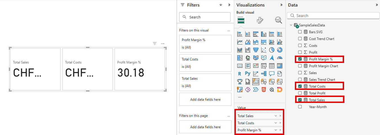
- Add
-
Format each Card to display the SVG:
- Go to the Format pane (paint roller icon)
- Expand the Images section
- Under Apply settings to, select Total Series
- Turn on Image toggle
- Set Image type to URL
- Click the Fx (conditional formatting) button next to Image URL
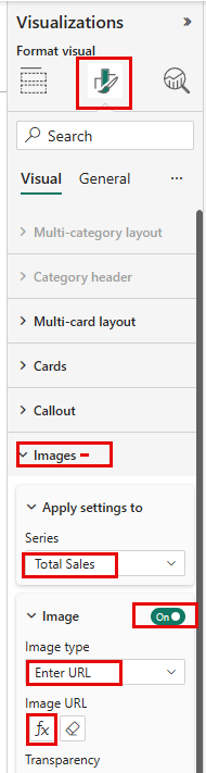
- In the “Format Image URL” dialog, select Field value
- Choose your SVG measure from the dropdown (e.g.,
Sales Trend Chart)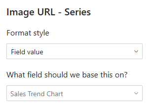
- Click OK
-
Arrange them vertically to compare trends across all metrics
-
Repeat for each chart measure
Parameter Guide
| Parameter | Type | Description | Example Values |
|---|---|---|---|
| MeasureValue | anyref | The measure to visualize | [Total Sales], [Total Costs], [Profit Margin %] |
| CategoryColumn | anyref | The dimension column for X-axis | SampleSalesData[Year-Month] |
| CategoryOrder | anyref | Sort direction for categories | ASC (chronological), DESC (reverse) |
| GoodNature | anyref | Color scheme interpretation | 1 (high=good), 2 (high=bad) |
Technical Deep Dive: Advanced DAX and UDF SVG Charts Concepts
Understanding DAX and UDF SVG Charts Measure Components
This section explains the key technical concepts and calculations used in the measure, breaking down each component for better understanding.
1. Data Foundation and Preparation
VAR Base = SUMMARIZECOLUMNS ( 'Date Table'[Year-Month] )
VAR WithValues = ADDCOLUMNS ( Base, "Value", [Sales])
VAR NonBlank = FILTER ( WithValues, NOT ISBLANK ( [Value] ) )
What This Does:
- Base: Creates a table with unique Year-Month values from your date dimension
- WithValues: Adds the measure value ([Sales]) for each month in the current filter context
- NonBlank: Removes any rows where the measure returns BLANK (no data for that period)
Why It Matters: This ensures we only visualize periods with actual data, preventing empty bars or gaps in the chart.
2. Value Normalization and Classification
VAR MaxVal = MAXX ( NonBlank, [Value] )
VAR MinVal = MINX ( NonBlank, [Value] )
VAR RangeVal = MaxVal - MinVal

VAR WithMetrics =
    ADDCOLUMNS (
        NonBlank,
        "HiLoFlag",
            VAR v = [Value]
            RETURN SWITCH ( TRUE(),
                v = MaxVal, "good",
                v = MinVal, "bad",
                "default"
            ),
        "RowNumber", RANKX ( NonBlank, 'Date Table'[Year-Month], , ASC, DENSE )
    )
What This Does:
- Finds the highest and lowest values in the dataset
- Calculates the total range (difference between max and min)
- Assigns each data point a classification: “good” (highest), “bad” (lowest), or “default”
- Assigns a sequential row number for positioning bars left to right
Why It Matters: This enables proportional scaling and conditional formatting based on data values.
3. Context-Aware Color Scheme
VAR GoodNature = 1  // 1 = high is good, 2 = high is bad

var GoodNatureStyle = SWITCH(GoodNature,
    1, ".default { fill: #9ca3af; }
        .good { fill: #014D17; }
        .bad  { fill: #C2130C; }",
    2, ".default { fill: #9ca3af; }
        .good { fill: #C2130C; }
        .bad  { fill: #014D17; }"
)
What This Does:
- GoodNature = 1: High values are positive (Sales, Profit) → Highest = Green, Lowest = Red
- GoodNature = 2: High values are negative (Costs, Defects) → Highest = Red, Lowest = Green
Why It Matters: The same visualization logic adapts to different business contexts by reversing the color meaning.
4. Canvas Dimensions and Bar Spacing
VAR SVGWidth = 500
VAR SVGHeight = 300
VAR ChartHeight = SVGHeight * 0.8  // 240px
VAR ChartTop = SVGHeight * 0.1      // 30px
VAR StartX = 20
VAR EndX = SVGWidth - 20
VAR AvailableWidth = EndX - StartX  // 460px
VAR BarSpacingRatio = 0.2
VAR TotalBarWidth = AvailableWidth / RowCount
VAR BarWidth = TotalBarWidth * ( 1 - BarSpacingRatio )
Calculation Breakdown:
- Fixed Canvas: 500×300px provides consistent viewBox across all data scenarios
- Chart Area: 240px (80% of height) with 30px top padding and 30px bottom padding
- Horizontal Margins: 20px on left and right sides
- Available Width: 460px (500 - 20 - 20)
- Dynamic Bar Width: Automatically adjusts based on data point count
- With 10 bars: TotalBarWidth = 46px → BarWidth = 36.8px (80%) with 9.2px spacing (20%)
- With 20 bars: TotalBarWidth = 23px → BarWidth = 18.4px (80%) with 4.6px spacing (20%)
Why It Matters: Fixed canvas ensures consistency while dynamic bar widths provide responsive adaptation to any dataset size.
5. Zero Baseline Calculation
VAR ZeroLineY =
    IF(RangeVal = 0,
        ChartTop + ChartHeight,
        ChartTop + ChartHeight * (MaxVal / RangeVal)
    )

VAR MinBarHeightPercent = 0.05
What This Does:
- All Positive Values (0 to 100): Zero line at bottom → 30 + 240 = 270px
- Mixed Values (-50 to 100): Zero line proportionally positioned
- Range = 150, MaxVal = 100
- ZeroLineY = 30 + (240 × 100/150) = 30 + 160 = 190px
- All Negative Values (-100 to 0): Zero line at top → 30px
- Minimum Height: 5% (12px) ensures smallest bars remain visible
Why It Matters: Correct baseline positioning is essential for accurate visual representation of both positive and negative values.
6. SVG Structure and Styling
VAR SVGHeader =
    "<svg xmlns='http://www.w3.org/2000/svg' viewBox='0 0 " & SVGWidth & " " & SVGHeight &
    "' width='" & SVGWidth & "' height='" & SVGHeight & "' preserveAspectRatio='none'>" &
    "<style>" & GoodNatureStyle & "</style><g id='bars'>"
What This Creates:
<svg xmlns='http://www.w3.org/2000/svg' viewBox='0 0 500 300'
     width='500' height='300' preserveAspectRatio='none'>
  <style>
    .default { fill: #9ca3af; }
    .good { fill: #014D17; }
    .bad  { fill: #C2130C; }
  </style>
  <g id='bars'>
Why It Matters: CSS classes enable efficient styling without inline attributes on every bar element.
7. Dynamic Bar Generation
VAR SVGBars =
    CONCATENATEX (
        WithMetrics,
        VAR CurrentValue = [Value]
        VAR CurrentHighLoFlag = [HiLoFlag]
        VAR CurrentRow = [RowNumber]
        VAR IsNegative = CurrentValue < 0

        VAR AbsValue = ABS(CurrentValue)
        VAR ProportionalHeight =
            IF(RangeVal = 0,
                MinBarHeightPercent * ChartHeight,
                (AbsValue / RangeVal) * ChartHeight
            )
        VAR BarHeight = MAX(ProportionalHeight, MinBarHeightPercent * ChartHeight)

        VAR XPos = StartX + ( CurrentRow - 1 ) * TotalBarWidth

        VAR YPos =
            IF(IsNegative,
                ZeroLineY,
                ZeroLineY - BarHeight
            )

        RETURN
            "<rect x='" & XPos &
            "' y='" & YPos &
            "' width='" & BarWidth &
            "' height='" & BarHeight &
            "' class='"&CurrentHighLoFlag&"' rx='2'/>",
        "",
        'Date Table'[Year-Month], DESC
    )
Position Logic Explained:
For Positive Values (+100 with max 200):
- ProportionalHeight = (100 / 200) × 240 = 120px
- BarHeight = MAX(120, 12) = 120px
- XPos = 20 + (RowNumber - 1) × TotalBarWidth (e.g., 20, 66, 112…)
- YPos = 270 - 120 = 150px (starts at top of bar)
- Result: Bar drawn from y=150 to y=270 (grows upward from baseline)
For Negative Values (-50 with min -100):
- AbsValue = 50
- ProportionalHeight = (50 / 200) × 240 = 60px
- BarHeight = MAX(60, 12) = 60px
- YPos = 270px (starts at zero line)
- Result: Bar drawn from y=270 to y=330 (grows downward from baseline)
Why It Matters: Understanding SVG coordinate system (Y increases downward) is key to proper bar positioning.
8. SVG Completion and Data URI
VAR SVGFooter =
    "</g><line x1='" & StartX &
    "' y1='" & ZeroLineY &
    "' x2='" & EndX &
    "' y2='" & ZeroLineY &
    "' stroke='#e5e7eb' stroke-width='2'/></svg>"

VAR FinalSVG = SVGHeader & SVGBars & SVGFooter

RETURN
    "data:image/svg+xml;utf8," & FinalSVG
What This Does:
- Closes the bars group (
</g>) - Adds a horizontal baseline line at ZeroLineY position
- Closes the SVG element (
</svg>) - Concatenates all parts: header + bars + footer
- Prefixes with data URI scheme for direct embedding
Why It Matters: The data URI format allows direct embedding in HTML visuals without external file dependencies.
9. Performance Considerations
Single CONCATENATEX Call:
- Generates all bars in one iteration over the data
- More efficient than multiple iterator functions
- DAX engine optimizes string concatenation operations
Pre-calculated Constants:
- Variables like SVGWidth, ChartHeight, TotalBarWidth are calculated once
- Reused multiple times without redundant computation
- Reduces processing overhead in the iterator
Efficient Normalization:
- Range value calculated once:
RangeVal = MaxVal - MinVal - Used repeatedly in bar height calculations:
(AbsValue / RangeVal) * ChartHeight - Avoids recalculating min/max for each bar
Customization Options
Modifying Visual Appearance and Behavior
Change Colors
Edit the GoodNatureStyle variable:
var GoodNatureStyle = SWITCH(GoodNature,
    1, ".default { fill: #9ca3af; }
        .good { fill: #0066CC; }      // Change to blue
        .bad  { fill: #FF6600; }",    // Change to orange
    ...
)
Adjust Spacing
VAR BarSpacingRatio = 0.3 // Increase gap between bars
Change Canvas Size
VAR SVGWidth = 800   // Wider chart
VAR SVGHeight = 400  // Taller chart
Adjust Chart Area
VAR ChartHeight = SVGHeight * 0.9  // Use 90% of height
VAR ChartTop = SVGHeight * 0.05    // 5% top padding
References
- DAX user-defined functions (preview) - Microsoft Learn
- DAX query view - Power BI Documentation
- TMDL view - Power BI Documentation
- INFO.FUNCTIONS - DAX Function Reference
Comments
Share your take or ask a question below.