Featured Content

AI Agent Skills: Stop Paying for Tokens You Don't Need
AI agent Skills replace bloated instruction files with on-demand context loading — cutting token waste by 80% for Excel and Power Query workflows.
AI Agent Skills: Stop Paying for Tokens You Don't Need
AI agent Skills replace bloated instruction files with on-demand context loading — cutting token waste by 80% for Excel and Power Query workflows.

KPI Tree for Performance Management: A Visual 7-Step Guide
KPI Tree for Performance Management: a practical 7-step method to align strategy with KPIs, cut metric overload, and create dashboards people actually use.

Why Your BI Team Needs a Product Mindset, Not Just Reports
Discover why developing a BI team product mindset is essential for building compounding value. Learn how to shift from reactive reporting to strategic product thinking.

DAX and UDF SVG Charts in Power BI: Complete Guide
Learn to build DAX and UDF SVG charts in Power BI with this complete guide. Create custom visualizations using pure DAX code with dynamic scaling and conditional formatting.

Automating Power BI Themes with Fabric, Notebooks and BIBB Theme Generator API: A Complete Guide
Learn how to automate Power BI report theme updates using Microsoft Fabric, Python, and the BIBB Theme Generator API for seamless theme management.

What is a Template in Power BI? Settling the debate.
Understand what each Power BI Template type does, when to use it, and how it shapes the user experience.

Improving BI User Experience in Corporate Environments: Practical Strategies That Work
Discover actionable techniques for improving BI user experience in corporate environments, focusing on user personas, training, and documentation.

Data Exfiltration in Power Query - Understanding the Risk and Protections
Data Exfiltration in Power Query: Understanding the Risk and Protections

Automation of the 'Meet the Team' PDF Slides with Power BI
Automate 'Meet the Team' PDF slides using Power BI, SharePoint, and Power Automate to save time, ensure consistency, and scale across proposals.

Master Power BI Time Comparisons and Top N Analysis for Optimal Performance
Learn how to perform Power BI Time Comparisons and Top N Analysis with optimal performance using calculation groups and field parameters instead of slow RANKX functions.
DAX + UDF = the React of Power BI

What is React? (for Power BI users)
React is an open-source JavaScript library, built by Meta, that helps developers compose interactive user interfaces out of small, reusable components. Each component accepts props (inputs) and manages how markup, styles, and behavior are combined before rendering to the screen.
If you spend most of your time in Power BI, think of React components as cousins of your DAX measures: they hide complexity behind a friendly interface, let you reuse logic across many visuals, and guarantee consistent presentation.
Throughout this walkthrough you’ll map those React ideas to DAX user-defined functions. A single UDF will play the role of a React component—encapsulating the HTML, parameterizing the dynamic bits, and making it effortless to reuse the visual shell anywhere in your report.
Build reusable HTML cards with DAX UDFs
Power BI’s DAX user-defined functions (UDFs) let you centralize HTML snippets and reuse them across visuals. In this guide you’ll assemble a flexible KPI card experience—complete with progress bars—that slots neatly into any HTML visual.
What you’ll build
- A calculated table with sample product data to feed your “components”
- A
BuildCardDAX function that returns a styled HTML card—your React-like component in DAX - A measure that concatenates those cards for an HTML visual, effectively “rendering” the component tree
- An optional table-row variation for tabular layouts when you need a different component shape
Prerequisites
- Enable DAX user-defined functions under File → Options and settings → Options → Preview features
- Power BI Desktop with the HTML Content visual (or similar) from AppSource
- Basic familiarity with DAX measures and the model view
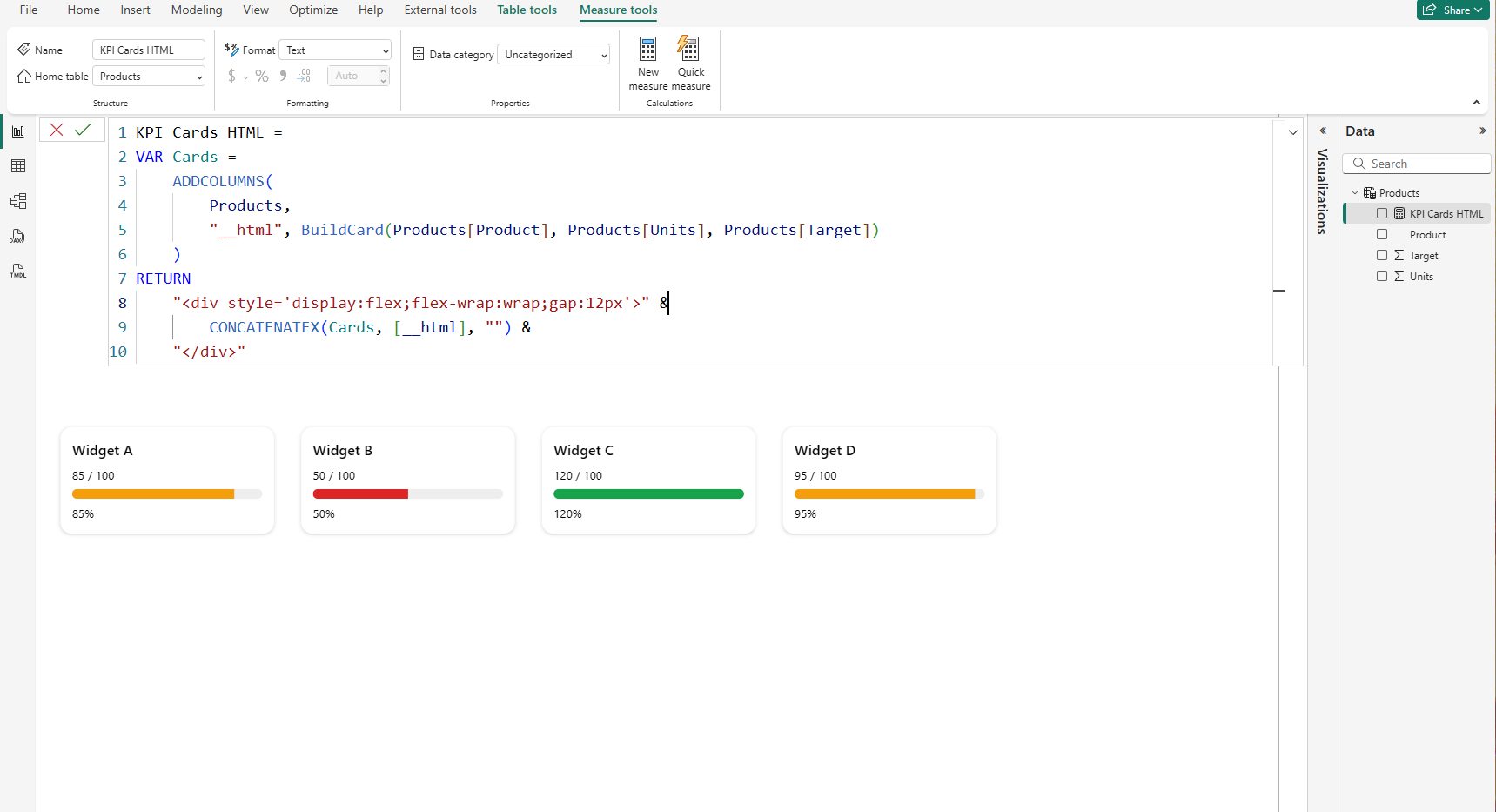 Preview of the reusable KPI card layout in an HTML visual
Step-by-step build
Step 1. Create the demo data table
Add a calculated table in Model view → New table and paste the following definition to keep the sample lightweight.
Calculated table: Products
Products =
DATATABLE(
    "Product", STRING,
    "Units", INTEGER,
    "Target", INTEGER,
    {
        {"Widget A", 85, 100},
        {"Widget B", 50, 100},
        {"Widget C", 120, 100},
        {"Widget D", 95, 100}
    }
)
Use slicers or filters to swap in your real dataset later; the UDF and measure will scale automatically.
Step 2. Author the HTML card function
Create the DAX function in DAX Query View → New query, then choose Update model → Add new function so it becomes callable from your measures. This function is your component blueprint: parameters mirror props and the returned HTML is the JSX-like template.
Function: BuildCard
DEFINE
    FUNCTION BuildCard = (
        Product : STRING,
        Units   : NUMERIC,
        Target  : NUMERIC
    ) =>
    VAR pct   = DIVIDE(Units, Target, 0)
    VAR color = IF(pct >= 1, "#16a34a", IF(pct >= 0.8, "#f59e0b", "#dc2626"))
    RETURN
        "<div style='font-family:Segoe UI;display:inline-block;vertical-align:top;width:220px;margin:8px;padding:12px;border-radius:12px;box-shadow:0 1px 4px rgba(0,0,0,.15);background:#fff'>
            <div style='font-weight:600;margin-bottom:6px'>" & Product & "</div>
            <div style='font-size:12px;margin-bottom:6px'>" & FORMAT(Units,"#,0") & " / " & FORMAT(Target,"#,0") & "</div>
            <div style='height:10px;background:#eee;border-radius:6px;overflow:hidden'>
                <div style='width:" & FORMAT(pct*100,"0") & "%;height:100%;background:" & color & ";'></div>
            </div>
            <div style='font-size:12px;margin-top:6px'>" & FORMAT(pct,"0%") & "</div>
        </div>"
The function chooses a color based on goal attainment, handles divide-by-zero with DIVIDE, and emits a complete HTML card string ready for the visual.
Step 3. Concatenate cards for the HTML visual
Create a measure that loops through your dataset, calls BuildCard, and wraps the result in a flexible container so cards flow naturally. Think of it as the render phase that instantiates your component for each row and mounts them in a parent container.
Measure: KPI Cards HTML
KPI Cards HTML :=
VAR Cards =
    ADDCOLUMNS(
        Products,
        "__html", BuildCard(Products[Product], Products[Units], Products[Target])
    )
RETURN
    "<div style='display:flex;flex-wrap:wrap;gap:12px'>" &
        CONCATENATEX(Cards, [__html], "") &
    "</div>"
CONCATENATEX keeps the output as a single string—a requirement for HTML visuals—while the flex container manages responsive layout.
Step 4. Render the cards inside an HTML visual
- Add the HTML Content (or comparable) visual to your report canvas.
- Place the KPI Cards HTML measure into the visual’s Values field.
- Disable sanitization or script blocking if the visual exposes that setting; this layout uses plain HTML and CSS only.
- Adjust card widths, font sizes, or colors directly inside
BuildCardfor quick brand customization.
Optional variations
Output a full HTML table
Prefer a tabular layout? Create a row-level UDF and reuse the same pattern to stitch rows together for the visual—consider it an alternate component that renders a table row instead of a card.
Function: BuildRow
DEFINE
    FUNCTION BuildRow = (
        Product : STRING,
        Units   : NUMERIC,
        Target  : NUMERIC
    ) =>
    VAR pct = DIVIDE(Units, Target, 0)
    RETURN
        "<tr>
            <td style='padding:6px 12px;border-bottom:1px solid #eee'>" & Product & "</td>
            <td style='padding:6px 12px;border-bottom:1px solid #eee;text-align:right'>" & FORMAT(Units,"#,0") & "</td>
            <td style='padding:6px 12px;border-bottom:1px solid #eee;text-align:right'>" & FORMAT(Target,"#,0") & "</td>
            <td style='padding:6px 12px;border-bottom:1px solid #eee'>" & FORMAT(pct,"0%") & "</td>
        </tr>"
Measure: HTML Table
HTML Table :=
VAR Rows =
    ADDCOLUMNS(
        Products,
        "__row", BuildRow(Products[Product], Products[Units], Products[Target])
    )
RETURN
    "<table style='font-family:Segoe UI;border-collapse:collapse;width:100%'>
        <thead>
            <tr>
                <th style='text-align:left;padding:6px 12px;border-bottom:2px solid #ccc'>Product</th>
                <th style='text-align:right;padding:6px 12px;border-bottom:2px solid #ccc'>Units</th>
                <th style='text-align:right;padding:6px 12px;border-bottom:2px solid #ccc'>Target</th>
                <th style='text-align:left;padding:6px 12px;border-bottom:2px solid #ccc'>% of Target</th>
            </tr>
        </thead>
        <tbody>" &
            CONCATENATEX(Rows, [__row], "") &
        "</tbody>
    </table>"
Use slicers to control row volume and avoid overwhelming the HTML visual.
Troubleshooting and pro tips
Common pitfalls
- Blank output: Confirm the measure returns a single string. Columns or tables won’t render.
- Function unavailable: After adding a UDF in DAX Query View, choose Update model → Add new function.
- Service differences: Preview features may evolve; test in the Power BI Service before rolling out.
- Styling tweaks: Turn inline styles into variables at the top of your UDF for quick brand swaps.
Wrap-up
DAX UDFs unlock reusable HTML interfaces inside Power BI, letting you refactor one component and refresh every visual powered by it. Just like React components, you can swap styles, add variants, or compose new layouts without rewriting markup. Adapt the card, mix in SVG sparklines, or build tabular layouts—the pattern stays the same, and your visuals stay delightfully consistent.
Comments
Share your take or ask a question below.