Featured Content

AI Agent Skills: Stop Paying for Tokens You Don't Need
AI agent Skills replace bloated instruction files with on-demand context loading — cutting token waste by 80% for Excel and Power Query workflows.
AI Agent Skills: Stop Paying for Tokens You Don't Need
AI agent Skills replace bloated instruction files with on-demand context loading — cutting token waste by 80% for Excel and Power Query workflows.

KPI Tree for Performance Management: A Visual 7-Step Guide
KPI Tree for Performance Management: a practical 7-step method to align strategy with KPIs, cut metric overload, and create dashboards people actually use.

Why Your BI Team Needs a Product Mindset, Not Just Reports
Discover why developing a BI team product mindset is essential for building compounding value. Learn how to shift from reactive reporting to strategic product thinking.
DAX and UDF SVG Charts in Power BI: Complete Guide
Learn to build DAX and UDF SVG charts in Power BI with this complete guide. Create custom visualizations using pure DAX code with dynamic scaling and conditional formatting.

DAX + UDF = the React of Power BI
Learn how to combine Power BI DAX user-defined functions with HTML visuals to build reusable KPI cards, tables, and progress bars that wow report stakeholders.
Automating Power BI Themes with Fabric, Notebooks and BIBB Theme Generator API: A Complete Guide
Learn how to automate Power BI report theme updates using Microsoft Fabric, Python, and the BIBB Theme Generator API for seamless theme management.

What is a Template in Power BI? Settling the debate.
Understand what each Power BI Template type does, when to use it, and how it shapes the user experience.

Improving BI User Experience in Corporate Environments: Practical Strategies That Work
Discover actionable techniques for improving BI user experience in corporate environments, focusing on user personas, training, and documentation.

Data Exfiltration in Power Query - Understanding the Risk and Protections
Data Exfiltration in Power Query: Understanding the Risk and Protections

Automation of the 'Meet the Team' PDF Slides with Power BI
Automate 'Meet the Team' PDF slides using Power BI, SharePoint, and Power Automate to save time, ensure consistency, and scale across proposals.
Effective Dashboard Design: Essential Layout Strategies for Clear, Actionable BI Dashboards

Explore key strategies for effective dashboard design, ensuring data is visible and actionable.
Designing a dashboard isn’t just about throwing data on a screen. It’s about telling a story that helps people make smart decisions quickly, and the layout of your dashboard plays a huge role in this.
How? In this article, we’ll explore the role of dashboard layouts within the overall process of designing dashboards, the essential elements of a dashboard, and methods for prioritising and effectively organising these elements on a single screen.
Not All Is About the Layout
When you finally arrange your dashboard, it’s the final piece of the puzzle. First, you’ve got to dive deep into who will be using it. What decisions do they need to make? What insights do they need, and how do we best visualise it? There’s much to figure out before you even think about where things go on the page.
Dashboard Design Mantra
When initiating effective dashboard design, the first step is prioritising the elements crucial to the dashboard’s functionality. Renowned user interface expert Ben Shneiderman formulated the principle of ‘Overview first, zoom and filter next, and details on-demand,’ a method integral to creating efficient visualisation systems that align with effective dashboard design strategies.
Here’s how that works for me and my dashboards.
Overview First
Offer users a clear understanding of WHAT HAS HAPPENED. The dashboard should immediately inform the user about the status of key metrics. Showcase those metrics in comparison to relevant benchmarks and within a temporal context. This helps users know if they need to dig deeper or if they’re done.
Utilising KPI cards, with or without sparklines, can signal whether everything is on track or if further investigation is needed.
Zoom and Filter
Next, let users break down the data.
Make it explicit WHERE THE PROBLEM EXISTS. Does it affect the entire organisation or specific to a particular region or business unit?
Determine WHEN THE ISSUE OCCURRED. Is it an isolated incident or a recurring problem? Are there negative trends or seasonal patterns at play? The majority of chart types can be employed in this phase. Begin by considering bar charts and bullet graphs for category comparisons and line, area, or column charts for time series analysis.
Ensure they are equipped with interactive elements such as a filter and/or a time slicer.
Details
Lastly, help users figure out why things are how they are.
Incorporate related metrics and business drivers into your dashboard. They serve as vital pieces of the puzzle in understanding WHAT CAUSED THE PROBLEM and, ultimately, answering the pivotal question of WHY.
Tools like bullet graphs and sparklines enable you to visualise how business drivers compare to benchmarks and evolve over time, all within a compact space.
Advanced: Creating an Ecosystem of Connected Dashboards
In the real world, it’s not just about crafting a standalone dashboard; it’s about creating an ecosystem of dashboards that work together, helping teams collaborate and make interconnected decisions. Think about it - your finance dashboards link up with marketing and operations, which tie into customer behaviour and competitive analysis dashboards. It’s all connected, where key metrics on one dashboard fuel insights on another.
And here’s a pro tip: leverage drill-through functionality. This is what transforms your dashboard from a static page into a dynamic tool. It allows your users to zoom from a small detail, like a bullet graph on a specific business metric, straight into a comprehensive dashboard dedicated to that topic with just one click. This on-demand access to more details is gold for your business users.
Z-pattern Layout Strategy
Knowing the essential components of the dashboard, like the overview, breakdowns and filters, and business drivers, let’s explore how to arrange them all on a single screen.
We typically design boards with a Z pattern (or zig-zag pattern) in mind. This means we place the most important information in the top left corner (A), followed by additional context, breakdowns, and related KPIs in B and C, and conclude with the least important information or the one we want to be seen the last in the bottom right corner (D).
That should be your first choice.
However, such a layout does not always work for various reasons, such as the size and orientation of individual elements or the composition of the entire dashboard.
Let’s examine another option, which will give you more control over where your user’s eye moves across your design.
Advanced Technique: Using White Space to Guide Eye Movement
Adjusting the width of the white space gap between visuals can affect the way people scan or read through your dashboard. Think about your reading patterns. You read a page of text line by line from left to right, but if the text has two columns, you read one column first and then move to the second. You do not jump from the first line of one column to the first line of the second column.
This is a Gestalt principle of proximity in action. The idea behind the proximity principle is pretty straightforward: when things are close to each other, they seem more connected or related than stuff that’s spread out more.
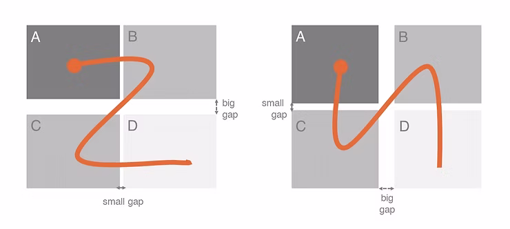 Gaps affecting eye movement
The same logic works in your dashboards. If you keep the middle vertical space wide enough, you can guide your user’s eye differently.
Try it!
Fast and Slow Dashboards
Ever wonder how the frequency of use impacts your dashboard layouts? Let’s discuss the “Fast and Slow Dashboards” concept.
Fast Dashboards
Fast Dashboards are your go-to daily (sometimes hourly!) dashboards. They focus on immediate timeframes - what’s happening today, what happened yesterday, or how this week is shaping up. The beauty of these dashboards is their familiarity to users. They’re so used to them that they not only remember how they look but also the numbers from the day before. This familiarity lets us design smarter, placing the most crucial figures in prime real estate (like the top left corner) and tucking filters and interactive bits where they’re out of the way, say, to the right.
Slow Dashboards
Slow Dashboards: These are the ones you might check monthly, quarterly, or even yearly, covering more extended periods like the last month, quarter, or year. Each visit might feel like a reintroduction, which means clarity is key. We must guide users through what they see - putting important filters front and centre, ensuring the time period is unmistakable, and providing explanations for metrics or charts right where you need them, like in an “Info” icon.
Keeping Your Dashboard on Point
One Page Only
Keeping your dashboard to a single page really makes you think carefully about what matters most. It pushes you to select elements and prioritise judiciously. Plus, it simplifies things for users, allowing them to grasp the story without flipping through several pages. Our memory isn’t great at holding onto numbers without context for too long. So, if you scatter parts of your story across pages 3, 7, and 10 of your dashboard, it’s pretty unlikely that users will get the whole picture. But if everything is on a one-pager, a user can easily understand the story, close their laptop, and still remember the narrative.
Simplicity is Key
Avoid unnecessary extras like background designs or elaborate borders. They’re distracting, add to cognitive load, and use valuable space. The most efficient way to separate elements from one another on your dashboard is through the use of white space.
Your dashboard needs room to breathe.
Opt for simple backgrounds and ample space between elements to maintain a clean, readable layout.
Design Over Decoration: Advanced Guidelines
Use icons and logos wisely. Icons can help users understand content at a glance. For example, a milk and cheese icon will be recognised faster than the word “Dairy.” However, too many icons can overwhelm and distract the user. Avoid using icons merely for decorative reasons.
As for logos, are they necessary? Most dashboards are for internal use, and it’s rare for anyone to forget which company they work for. Generally, logos don’t have a place in the dashboard area.
Avoid These Common Pitfalls
Most mistakes in dashboard design fall into one of these three categories:
Too Much Info
Avoid cramming too much data into your dashboard. Focus on what’s essential. If your dashboard includes more than one critical metric, consider whether it truly constitutes a single dashboard or could be divided into two or more separate ones.
Too Many Distractions
Aim for a simple, straightforward layout and a colour scheme that enhances readability and comprehension of the data. Important insights should be the focal point; all other elements should be subtle, using neutral colours, or possibly eliminated altogether.
Forgetting About Mobile
Keep in mind that many users may access your dashboard on their phones. Ensure it functions seamlessly on smaller screens. Opt for a dedicated, well-considered mobile design rather than solely relying on automatic responsive design adjustments.
Wrapping Up
Designing a good dashboard layout is crucial for ensuring the data tells the story you want it to tell. Keep it simple, focused, and user-friendly. And don’t be afraid to try new things. Every dashboard is a chance to learn and improve.
Iterate. That’s the key to ensuring your dashboard has a happy and long-lasting life. Businesses evolve, and so should your dashboards. It’s a common scenario for dashboards to fall out of use just a few months after they’re introduced. Don’t let this happen to yours. Adopt an agile, iterative approach to dashboard design. Gather feedback from users and make adjustments as needed. Remember, the design process is ongoing.
Creating a dashboard that hits all these notes isn’t easy, but it’s worth the effort. Remember, the goal is to make data useful and actionable for the people who need it most. Stick to these principles, avoid the common traps, and keep refining your approach. Happy dashboarding!
Comments
Share your take or ask a question below.