Featured Content

Power BI Master UI Template
Develop Data Visualization 80 % Faster - 4 Premium Templates · 7,000 Icons · 100% Theme Generator compatible
6 Power BI Modern Button Slicer UI Patterns for Better Dashboards
Learn 6 Power BI Button Slicer UI patterns to build modern dashboards: segmented controls, tabs, KPI cards, toggle buttons, and more.

Salesforce Power BI Integration: A Practical Comparison Guide
Salesforce Power BI integration done right: compare native connectors, custom API, and the Metrica connector to choose the best approach for your team.

AI Agent Skills: Stop Paying for Tokens You Don't Need
AI agent Skills replace bloated instruction files with on-demand context loading — cutting token waste by 80% for Excel and Power Query workflows.

KPI Tree for Performance Management: A Visual 7-Step Guide
KPI Tree for Performance Management: a practical 7-step method to align strategy with KPIs, cut metric overload, and create dashboards people actually use.

Why Your BI Team Needs a Product Mindset, Not Just Reports
Discover why developing a BI team product mindset is essential for building compounding value. Learn how to shift from reactive reporting to strategic product thinking.

DAX and UDF SVG Charts in Power BI: Complete Guide
Learn to build DAX and UDF SVG charts in Power BI with this complete guide. Create custom visualizations using pure DAX code with dynamic scaling and conditional formatting.

DAX + UDF = the React of Power BI
Learn how to combine Power BI DAX user-defined functions with HTML visuals to build reusable KPI cards, tables, and progress bars that wow report stakeholders.

Automating Power BI Themes with Fabric, Notebooks and BIBB Theme Generator API: A Complete Guide
Learn how to automate Power BI report theme updates using Microsoft Fabric, Python, and the BIBB Theme Generator API for seamless theme management.

What is a Template in Power BI? Settling the debate.
Understand what each Power BI Template type does, when to use it, and how it shapes the user experience.

Data Exfiltration in Power Query - Understanding the Risk and Protections
Data Exfiltration in Power Query: Understanding the Risk and Protections
How to Design Better KPIs Before They Mislead You

The Soviet government once set a measure for nail factories: the number of nails produced; factories responded by making millions of tiny, useless nails. After realizing the issue, the government switched the metric to kilograms. Factories responded this time by fabricating a giant, useless nails. The error was that no one had articulated the actual goal, neither appeared in the formula: a useful variety of nail sizes for a functioning economy.
The nail factory is an old story. I keep coming back to it because I keep seeing the same structure in modern corporate dashboards, built by competent people, approved by management, and trusted for months: green dashboards with invisible problems.
The dashboard that told the truth and nothing else
Some time ago, I worked with a company that had a corporate-wide offshoring project. The “success” of the project was shown in a management dashboard with a single metric: tracked outsourced personnel as a percentage of total headcount; the logic was straightforward: keep the ratio at an specified threshold, control costs. The formula was clean.
% Outsourced = [Outsourced Headcount] / [Total Headcount]
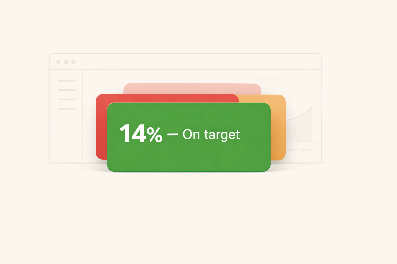
Most of the time, this card was green as the ratio sat comfortably on target, quarter after quarter.
What the report did not show was the rotation rate of the outsourced workforce. Contractors were churning at high frequency; each replacement meant a new hire, a full onboarding cycle, weeks before the replacement reached productive speed. The cost of that cycle, repeated dozens of times per year, was real. Despite its importance, it appeared nowhere in the report.
The KPI was not wrong. It was incomplete. And incomplete, in this case, meant misleading.
Why KPI design fails: formula incompleteness
A KPI is an indicator, not a goal, and that distinction is where better KPI design begins. The distinction sounds obvious until you watch a management team spend forty minutes in a review discussing whether the metric is 0.3 points above or below a threshold, without once asking what the metric is actually trying to indicate.
Business Performance Management literature has documented this failure for decades. Goodhart’s Law is the version most analysts know: when a measure becomes a target, it ceases to be a good measure. Formula incompleteness is a related but quieter problem. The metric was simply built to answer one question, and over time that question became the only question anyone asked. The goal had other dimensions. The formula did not.
I am not sure this generalizes cleanly to every context. But in every project where I have seen a dashboard mislead, the structure was the same. Numbers looked good while the underlying business reality did not, and the gap between them grew until something broke.
Before and after
Here is what the workforce dashboard looked like before anyone asked the harder questions.
One formula. One card. One answer to the wrong question.
One measure, one card, one answer. The report told you the ratio. It did not tell you what was happening underneath it.
% Outsourced =
DIVIDE ( [Outsourced HC], [Total HC] )
After some discussion, the conversation changed, and management decided to replace one measure with three.
% Outsourced =
DIVIDE ( [Outsourced HC], [Total HC] )

Outsourced Rotation Rate =
DIVIDE ( [New Outsourced Starts in Period], [Outsourced HC] )

Est. Retraining Cost =
[Outsourced Rotation Rate] * [Avg Onboarding Cost CHF] * [Outsourced HC]
Same data source. Three questions instead of one.
The original KPI did not change but the context did. Rotation at 68% per year meant the outsourced workforce was turning over entirely every eighteen months. An estimated CHF 240K per year in onboarding cost had been invisible, not because the data did not exist, but because nobody had built the measure. Now, the management team had a more complete picture of the situation, and the conversation shifted from “are we on target?” to “what can we do about this?”
The gap between what the formula measured and what the goal required looked like this.
Every KPI has a blind spot. The question is whether you have named it.
How to design better KPIs: four questions before you go live
The problem is not that people build bad metrics. Most analysts who want to design better KPIs are already asking the right questions. The issue is that stress-testing happens too rarely, and usually only after something breaks.
Four questions. Run them before the card goes on the dashboard.
These four questions are really one question asked four different ways: does this formula track what we actually care about, or does it just track itself?
The first asks you to write out the business outcome, not the metric name. “Control workforce cost” is a goal. ”% Outsourced” is a metric. They are not the same thing.
The second is the adversarial one, and the most important. Assume someone wants to keep the number green while the underlying situation deteriorates. How would they do it? If you can answer that easily, you have found your blind spot. For the outsourced headcount ratio, the answer was obvious in hindsight. You keep the ratio stable regardless of contractor churn, as long as replacements arrive fast enough. The ratio never signals the cost of those replacements. The formula rewarded a stable number, not a stable workforce.
The third and fourth follow from there. A metric always has edges; name them explicitly. Once you have named the gap, build the measure for it.
A KPI is a window
A KPI is a window into your business. The danger is not that the window is dirty. It is that you have pointed it at the wrong wall, and the dashboard is quietly confirming, in green, that everything you chose to look at is fine.
The goal was never to hit the target. The target was supposed to tell you whether you were hitting the goal. When those two things come apart, the report stops being useful and starts being comfortable.
Comments
Share your take or ask a question below.