Featured Content
Wireframing in Power BI
What is Wireframing in Power BI?
Wireframing is the process of creating a low-fidelity prototype of a Power BI report and dashboard. This can be done with various tools, such as pen and paper, or general-purpose and specialized software.
Wireframing aims to get a general sense of a Power BI report or dashboard’s layout, hierarchy, and flow before investing time and effort into designing and building it. This can be especially useful when working with stakeholders to gather feedback on the dashboard or report’s overall structure.
Wireframes can be as simple or complex as needed but should always be created to simplify and clarify the Power BI report or dashboard design process.
Benefits of wireframing:
Creating a wireframe before beginning to build a Power BI dashboard or report can be helpful for several reasons:
- Visualize integration: See how the different elements of your dashboard will fit together
- Early problem identification: Help in the identification of any potential problems with the layout early on in the development process
- User flow creation: Creation of user flows and interactive prototypes
- Clear planning: It allows you to plan the layout and structure of your dashboard or report in a clear and organized way
- Data prioritization: It helps you identify the most important data and visualizations to include and determine how to arrange them on the dashboard or report
- Stakeholder communication: It helps you communicate your design ideas to stakeholders and team members and get feedback on your plans before you start building the final product
- Time and effort savings: It can save you time and effort in the long run, allowing you to plan and design your dashboard or report before diving into the development process, which can help you avoid making changes or corrections later on
What’s NOT wireframing?
Wireframing is not about creating a final product. Generally, a wireframe is not about making things look pretty or adding in all the bells and whistles.
The wireframing process
When wireframing a Power BI business intelligence dashboard, it is important to follow a defined process to ensure success. The recommended process steps are as follows:
1. Discovery call
This is the first step in the process and is used to gather information about the project requirements and goals. As a rule of thumb, this should be around a one-hour call during which the user shows us the current reports and data sources. Here, we try to understand as best as we can the needs and wishes of the end-user.
2. Wireframing workshop
This is all about the “vision.” Incorporating what we know from the previous meeting, we start sketching and creating wireframes with the business users. This helps to get a general sense of the dashboard’s layout, hierarchy, and flow before investing time and effort into designing and building it.
3. Feedback and revisions
After the wireframing phase is complete, feedback and revisions are solicited from stakeholders to ensure that the dashboard meets their needs.
4. Final wireframes
The final wires are created once all feedback has been incorporated, and the Power BI dashboard development can start.
Wireframe tools
There are a variety of tools that can be used for wireframing Power BI reports and dashboards. The most important part is finding the best tool for you and your team. Some common tools for wireframing include:
- Pen and paper
- General-purpose software such as Microsoft PowerPoint
- Specialized software such as Balsamiq or Figma
Pen and paper
Pen and paper can be a great way to sketch out your ideas for a Power BI report or dashboard quickly. It’s a quick and easy way to write down your thoughts without worrying about the details.
One downside of using pen and paper is that it can be difficult to make changes or revisions once the wireframe is complete. This means that you may need to start from scratch if there are significant changes that need to be made.
 Example of pen and paper wireframing for Power BI
PowerPoint
Microsoft PowerPoint can also be used to wireframe Power BI reports and dashboards. While it’s not as specialized as some other tools, it’s still a great way to get a general sense of how your report or dashboard will look. PowerPoint has a variety of shapes and connectors that can be used to create basic wireframes.
- Use simple shapes and lines to create your report or dashboard layout
- Use layers to control the visibility of different elements
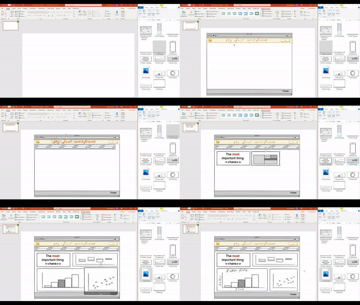 Wireframing in PowerPoint demonstration
Figma
Figma is specialized software for wireframing Power BI reports and dashboards. It is designed to make the process quick and easy, with various shapes and connectors that can be used to create basic wireframes.
One of the benefits of using Figma is the ability to create interactive prototypes. This can help get feedback from stakeholders early on in the development process. With Figma, you can create a prototype that looks and feels like the final product, which can help to get everyone on the same page.
Figma also offers several features that can help with collaboration. For example, you can invite others to view and edit your prototypes, which makes it easy to get feedback and make revisions.
Conclusion
Overall, creating a wireframe is a critical step in the design and development process of a Power BI dashboard or report. It allows stakeholders to come together and agree on the product’s desired structure, flow, look and feel and features. Additionally, it helps identify potential usability issues early on and ensure that all elements are properly integrated into the final product. By planning your Power BI report or dashboard with a wireframe prototype, you can create a better end result that meets everyone’s needs.











Comments
Share your take or ask a question below.