Featured Content
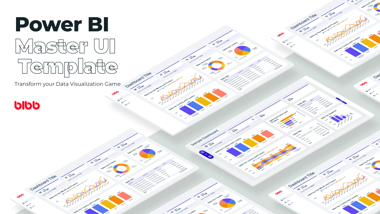
Power BI Master UI Template
Develop Data Visualization 80 % Faster - 4 Premium Templates · 7,000 Icons · 100% Theme Generator compatible
Salesforce Power BI Integration: A Practical Comparison Guide
Salesforce Power BI integration done right: compare native connectors, custom API, and the Metrica connector to choose the best approach for your team.

How to Design Better KPIs Before They Mislead You
How to design better KPIs starts with knowing what your formula isn't measuring. A real BI case study in dashboard blind spots, with DAX examples and a fix.
AI Agent Skills: Stop Paying for Tokens You Don't Need
AI agent Skills replace bloated instruction files with on-demand context loading — cutting token waste by 80% for Excel and Power Query workflows.
KPI Tree for Performance Management: A Visual 7-Step Guide
KPI Tree for Performance Management: a practical 7-step method to align strategy with KPIs, cut metric overload, and create dashboards people actually use.
Why Your BI Team Needs a Product Mindset, Not Just Reports
Discover why developing a BI team product mindset is essential for building compounding value. Learn how to shift from reactive reporting to strategic product thinking.
DAX and UDF SVG Charts in Power BI: Complete Guide
Learn to build DAX and UDF SVG charts in Power BI with this complete guide. Create custom visualizations using pure DAX code with dynamic scaling and conditional formatting.
DAX + UDF = the React of Power BI
Learn how to combine Power BI DAX user-defined functions with HTML visuals to build reusable KPI cards, tables, and progress bars that wow report stakeholders.
Automating Power BI Themes with Fabric, Notebooks and BIBB Theme Generator API: A Complete Guide
Learn how to automate Power BI report theme updates using Microsoft Fabric, Python, and the BIBB Theme Generator API for seamless theme management.
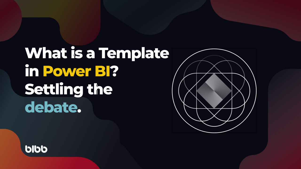
What is a Template in Power BI? Settling the debate.
Understand what each Power BI Template type does, when to use it, and how it shapes the user experience.
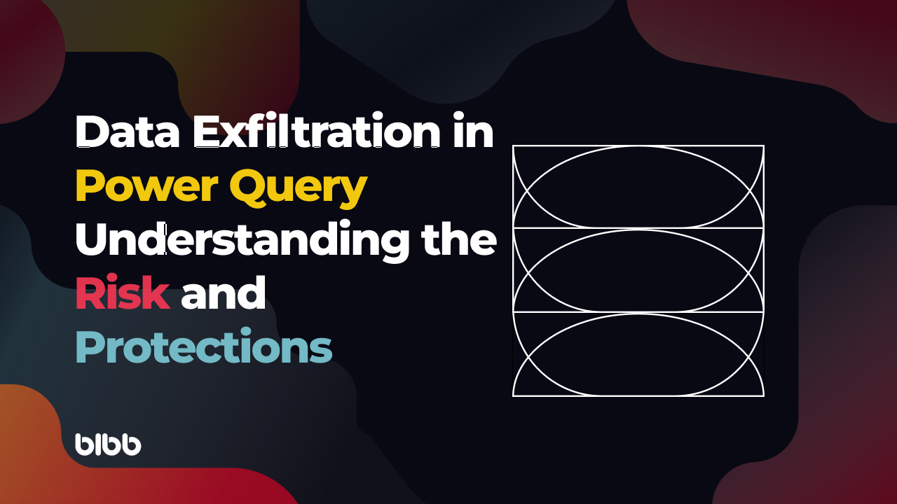
Data Exfiltration in Power Query - Understanding the Risk and Protections
Data Exfiltration in Power Query: Understanding the Risk and Protections
6 Power BI Modern Button Slicer UI Patterns for Better Dashboards

Discover six practical UI patterns you can build with the Power BI Button Slicer
Introduction
The Power BI Button Slicer Is More Flexible Than It Looks
The Button Slicer is one of my favourite native visuals in Power BI.
At first, I only used it as a regular slicer. But after experimenting with its formatting options, I realised it could become much more than just a filtering control.
With a little creativity, it can look less like a traditional slicer and more like a user interface component you would expect to see in a web or mobile application.
Some of these UI patterns use only the built-in formatting options, while others combine the Button Slicer with SVG images to create more customized interactions.
In this article, I’ll share six Power BI Button Slicer UI patterns that I’ve been using in my own dashboards.
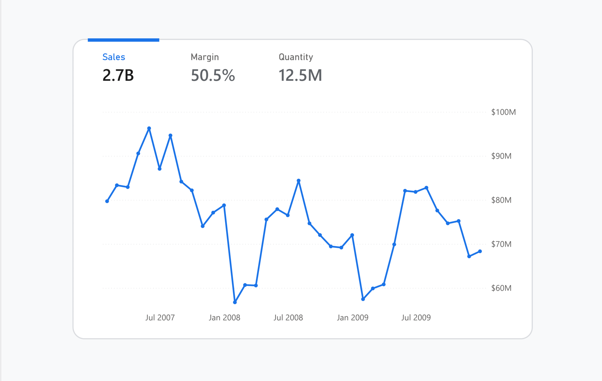
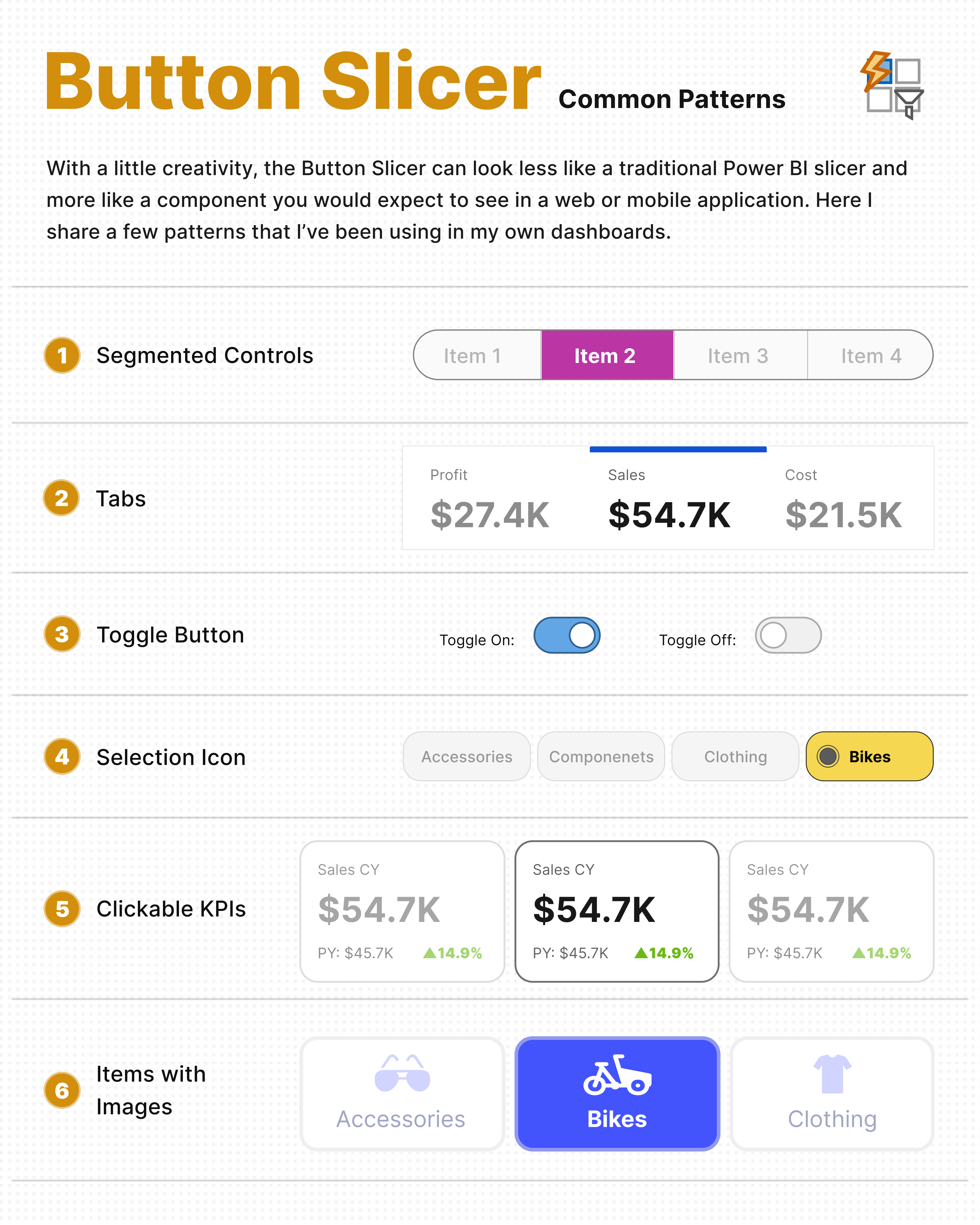 Six common UI patterns you can build using the native Power BI Button Slicer.
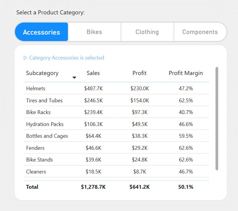
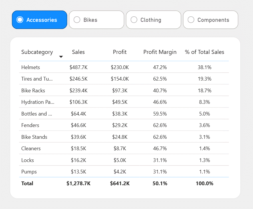
1- Segmented Controls
1- Segmented Controls
One of my favourite patterns is turning the Button Slicer into segmented controls.
This is a common interface component used in many web and mobile applications, and it works surprisingly well in Power BI.
Unlike some of the other patterns in this article, this one doesn’t require SVG images.
Everything is created using the built-in formatting options of the Button Slicer.
The only limitation is that the background colour and rounded corners are applied to the entire visual rather than each individual button. Fortunately, when the selected item is highlighted, the final result still looks clean and modern.
 Segmented controls created using only the built-in formatting options of the Button Slicer.
2- Tabs
2- Tabs
Another simple pattern you can build with the native Button Slicer is tabs.
By enabling the Accent Bar and positioning it at the top or bottom of the visual, the selected item becomes clearly highlighted, similar to the tabs used in many web applications.
Like the segmented control, this pattern only uses the built-in formatting options of the Button Slicer. A few adjustments to the accent bar, spacing, and colours are enough to create a clean and familiar interface for users.
This works well when users need to switch between different measures, metrics, or views without relying on dropdown slicers.
 The Accent Bar can be used to create a clean tab-style interface.
3- Toggle Buttons
3- Toggle Buttons
Another simple pattern is creating toggle buttons.
Instead of showing a long list of options, users can switch between two states, similar to an on/off switch found in many applications.
This pattern is created by using two images: one for the selected state and another for the default state.
Although it’s still a Button Slicer underneath, it feels much more like a native toggle control.
 Toggle buttons created by designing separate selected and unselected states.
4- Selection Icons
4- Selection Icons
One feature that is often overlooked is the built-in selection icon.
Power BI can automatically display a small icon beside the selected item, making it much easier for users to recognize which option is currently active.
Since this feature is built into the Button Slicer, there’s no need for SVG images or custom visuals.
Sometimes small visual details like this make the interface feel much more polished.
 The built-in selection icon helps users easily identify the active item.
5- Clickable KPI Cards
5- Clickable KPI Cards
This is one of the patterns I’ve started using more frequently in my dashboards.
Instead of selecting a KPI from a dropdown, users simply click directly on the KPI card they want to analyse.
The interaction is usually built using a Field Parameter or a disconnected table, while an SVG image is used as the background of each button to create the card design.
The selected KPI can then update other visuals across the report, creating a much more natural way to explore the dashboard.
With today’s LLMs making it much easier to generate SVG code, creating these kinds of interactions has become far more practical.
 Clickable KPI cards built with SVG backgrounds and the native Button Slicer.
6- Items with Images
6- Items with Images
The Button Slicer also supports images.
Instead of displaying only text, each item can have its own image or icon.
For example, you could use:
- Product categories
- Country flags
- Brand logos
- Product photos
Typically, two versions of each image are created—one for the default state and another for the selected state.
This allows the selected item to stand out while keeping the interface consistent.
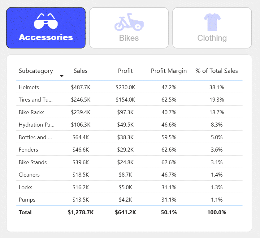 Images can be used for both default and selected states to create richer slicer interactions.
Download
All of the examples shown in this article are available on GitHub.
You can download the PBIX files, explore how each pattern is built, and adapt them to your own reports.
Whether you use the examples as they are or customize them further, I hope they help you create more interactive and user-friendly Power BI dashboards.
GitHub Repository
Power BI Design Files – Button Slicer Examples
Final Thoughts on Power BI Button Slicer UI Patterns
The Power BI Button Slicer is much more than a filtering visual.
With a little creativity, it can become an important building block for designing modern Power BI interfaces.
Some of these patterns rely only on native formatting, while others combine the Button Slicer with SVG images. Both approaches can significantly improve the user experience without requiring custom visuals.
I hope these examples give you a few ideas for your next dashboard.
Comments
Share your take or ask a question below.