
Featured Content

Power Query for Excel Users — New Book
12 real workplace scenarios. Every chapter ends with a deliverable. Follow Quinn from messy exports to a working data model. Published by Packt.

Building Claude Dashboards on Microsoft Fabric with Fabric IQ MCP
Build a Claude Dashboard from a Microsoft Fabric semantic model via the Fabric IQ MCP server: DAX queries, CSV snapshots, and the quirks we hit along the way.

Connecting Clockify to Power BI: Three Integration Patterns That Work
Connect Clockify to Power BI three ways: hand-rolled Web.Contents calls, the free custom connector, or a ready-made template. Pick by build versus ship.
bibb Analytics: Designing Measurement Like a BI Problem
The same framework we apply to client BI work applies here: goals first, layers second. Here is the strategy behind bibb.pro's analytics.
bibb Analytics Build in Public: Introduction
bibb.pro had GA4 running since day one. Events were firing. Data was collecting. But without a strategy, that is noise with a database attached. This series documents fixing that.
Git for Power BI and Fabric Users: A Beginner's Guide
Power BI and Fabric development is moving toward programmatic workflows. Here is what Git is, how to install it on Windows, and how to use it as a BI or Fabric developer.
6 Power BI Modern Button Slicer UI Patterns for Better Dashboards
Learn 6 Power BI Button Slicer UI patterns to build modern dashboards: segmented controls, tabs, KPI cards, toggle buttons, and more.
Salesforce Power BI Integration: A Practical Comparison Guide
Salesforce Power BI integration done right: compare native connectors, custom API, and the Metrica connector to choose the best approach for your team.

How to Design Better KPIs Before They Mislead You
How to design better KPIs starts with knowing what your formula isn't measuring. A real BI case study in dashboard blind spots, with DAX examples and a fix.

AI Agent Skills: Stop Paying for Tokens You Don't Need
AI agent Skills replace bloated instruction files with on-demand context loading — cutting token waste by 80% for Excel and Power Query workflows.

KPI Tree for Performance Management: A Visual 7-Step Guide
KPI Tree for Performance Management: a practical 7-step method to align strategy with KPIs, cut metric overload, and create dashboards people actually use.
Power BI SVG Measures: 7 Use Cases, 17 Rules, and an AI Prompt

TL;DR: Power BI SVG measures render faster than custom visuals, stay sharp at any size in most contexts, and work across 7 different places in a report. This guide covers where to use them, the rules that keep them from breaking, and includes a ready-to-use AI prompt template.
Why Power BI SVG Measures Actually Work
Over the years, SVG (Scalable Vector Graphics) has quietly become one of the most powerful tools in the Power BI developer’s toolkit.
If you’ve ever felt limited by native visuals, frustrated by the performance of custom visuals, or struggled to get the exact look you want, Power BI SVG measures are the answer.
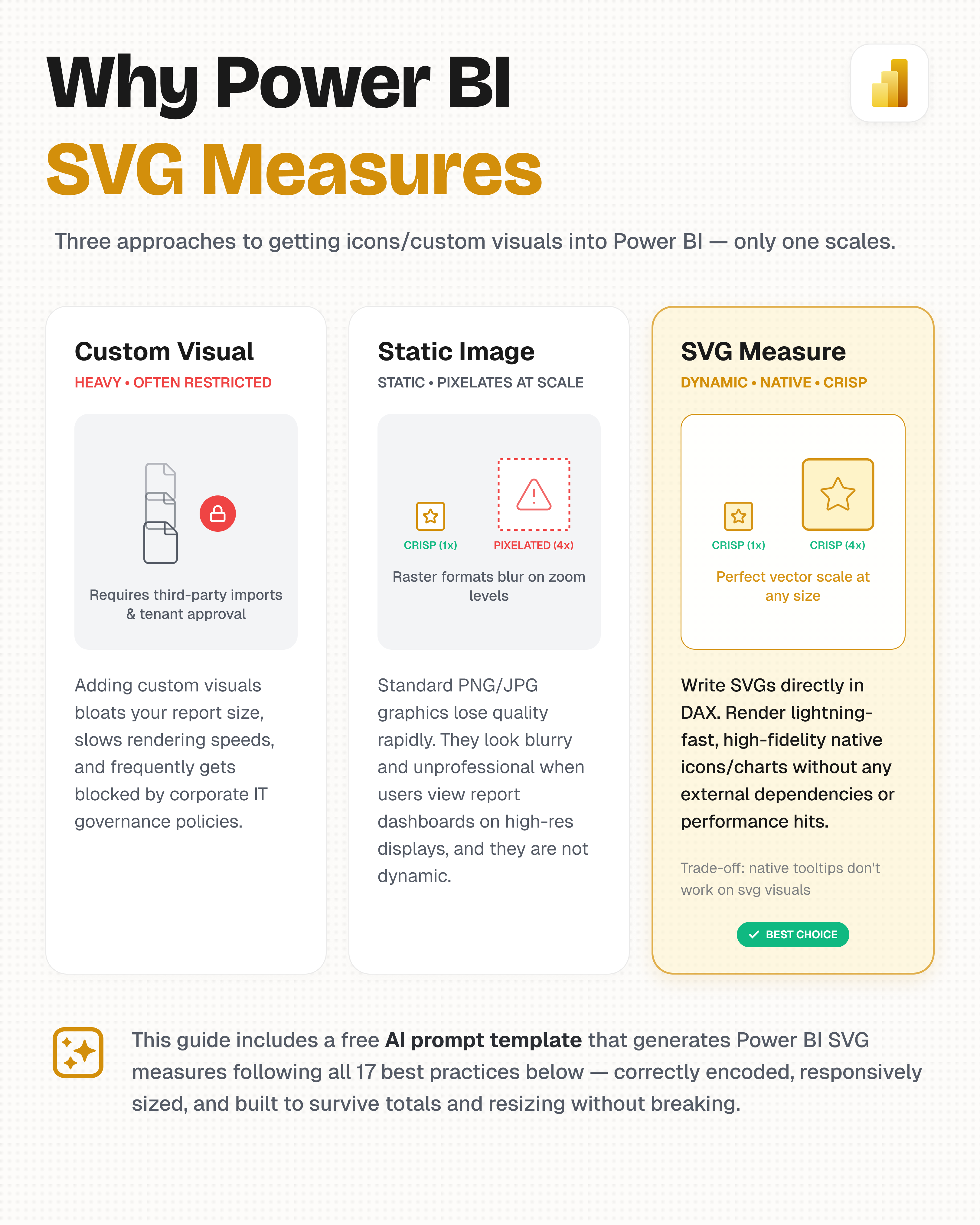
Power BI SVG measures give you customisation, native‑speed performance, and bypass enterprise custom‑visual restrictions.
Here is why they matter:
-
Customisation Without Limits: Native visuals are rigid. With Power BI SVG measures, you can design anything: KPI cards, traffic lights, mini bar charts, gauges, progress rings, and even complex infographics. Your brand, your logic, your rules.
-
Performance: Compared with many custom visuals, inline SVG measures can be lightweight because the SVG markup is generated as text rather than relying on external JavaScript libraries. With compact markup, they can perform well while giving you much more control over the visual.
-
Bypass Organisation Restrictions: Many enterprises restrict the import of third‑party custom visuals for security or compliance reasons. SVGs are native to Power BI (they are just text), meaning you can build highly customised interactions without asking for permission.
-
Resolution‑Independent (in most contexts): When rendered as a live vector (Table, Matrix, Card, and Image visuals), SVGs scale infinitely with no pixelation, sharp on retina displays, PDF exports, and PowerPoint slides. One notable exception: Azure Map markers are rasterized into a fixed‑resolution bitmap by the map engine before display, so they can blur if sized carelessly. See the sizing note under Azure Map Visual Markers below.
The #1 Beginner Trap: The 'Image URL' Setting
Before we go any further, let me save you hours of frustration.
If you write a Power BI SVG DAX measure that returns a perfectly formatted SVG string, and all you see in Power BI is the literal text, you forgot to set the Data Category.
Without this single step, Power BI will treat your carefully crafted DAX as plain text and display the raw SVG code instead of rendering the image. It is the most common reason beginners think their SVG measure is “broken”.
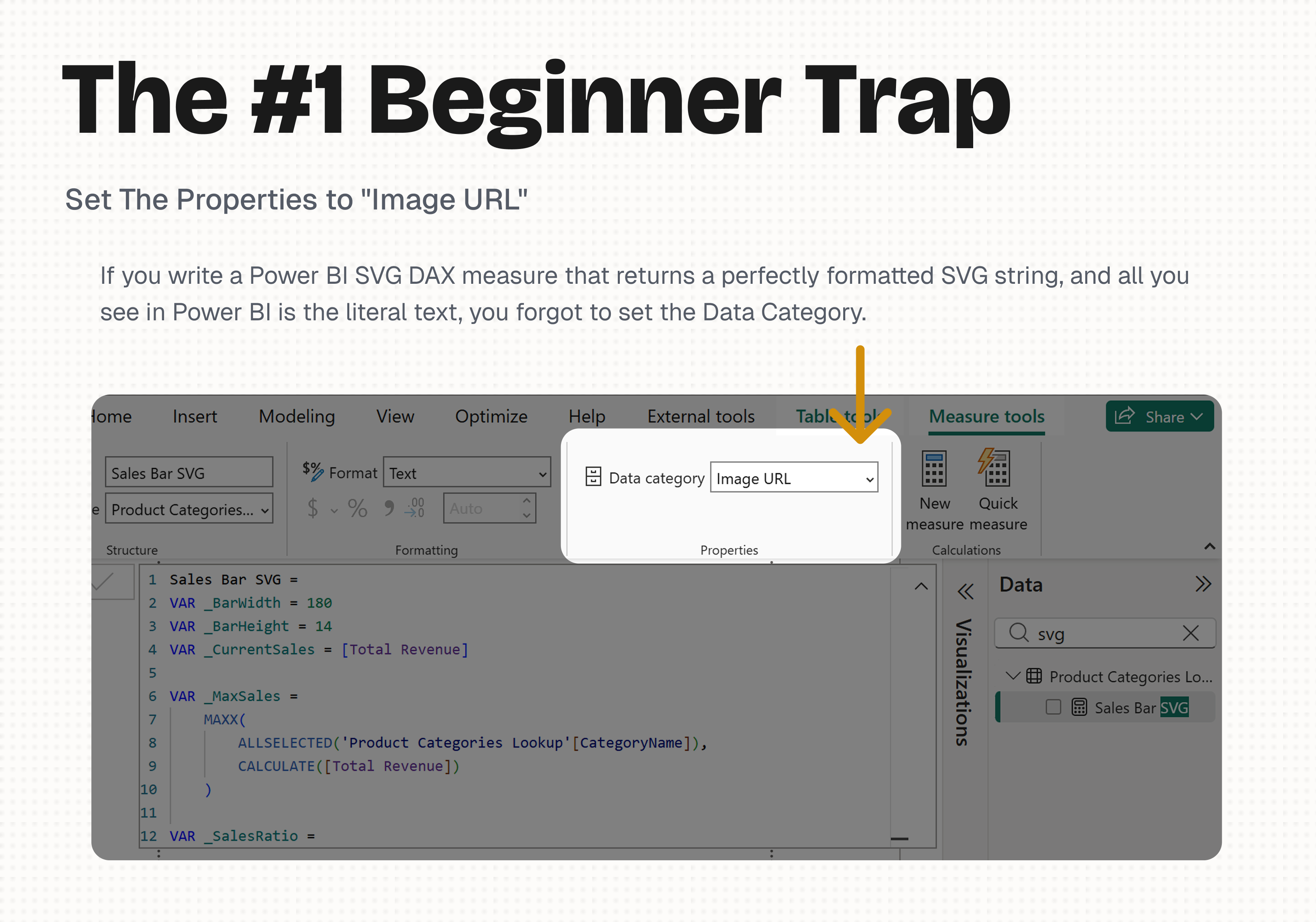
Action:
- In the Power BI model view, select your measure.
- In the “Properties” or “Formatting” pane, find Data category.
- Set it to “Image URL”.
1. Where Can You Use Power BI SVG DAX Images? (The 7 Places)
1. Where Can You Use Power BI SVG DAX Images? (The 7 Places)
I have mapped out all 7 entry points where you can leverage SVG images inside Power BI.
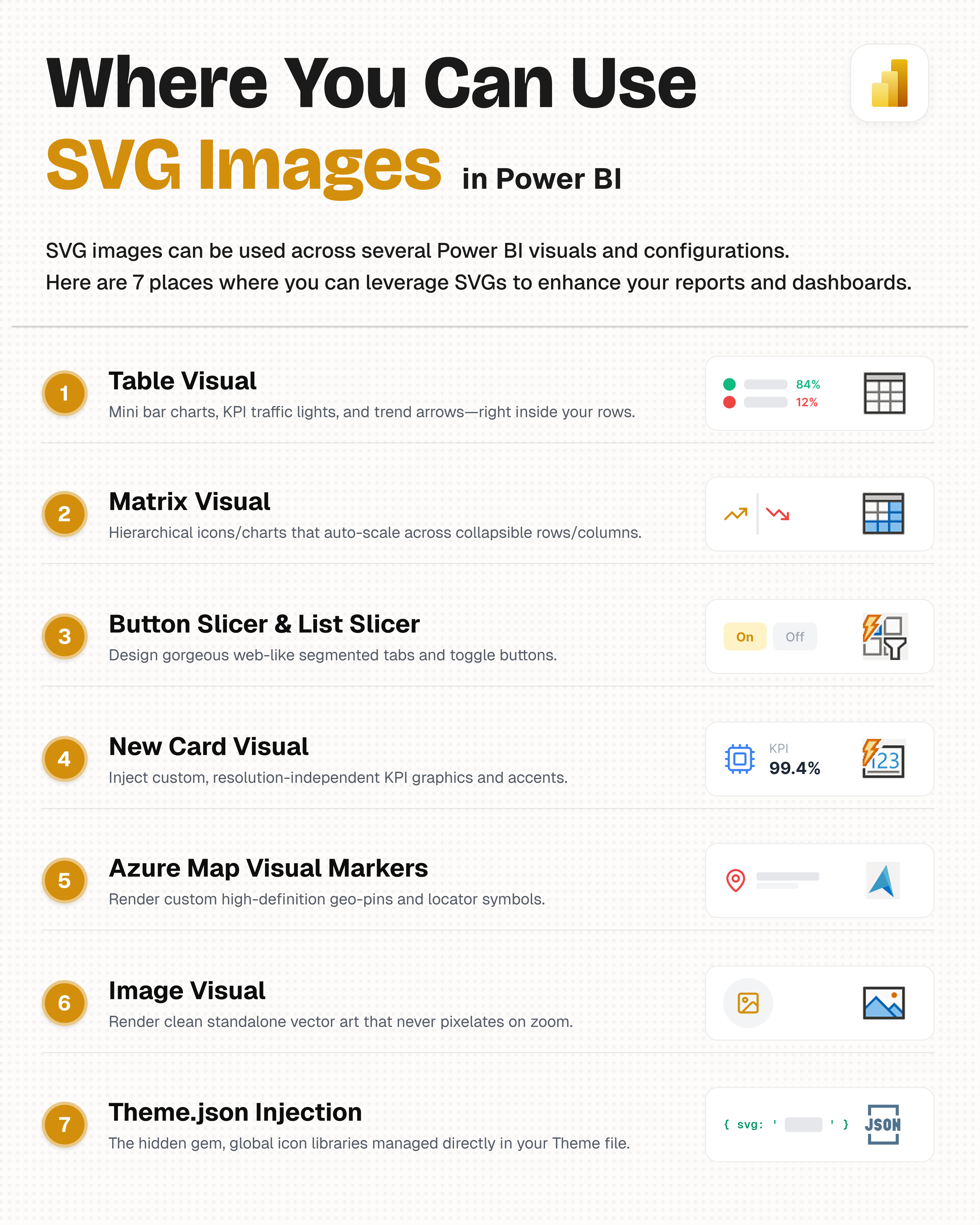
- Table Visual: Mini bar charts, KPI traffic lights, and trend arrows right inside your rows.
- Matrix Visual: Hierarchical icons and charts that auto‑scale across collapsible rows and columns.
- Button Slicer & List Slicer: Design gorgeous web‑like segmented tabs and toggle buttons.
- New Card Visual: Inject custom, resolution‑independent KPI graphics and accents.
- Azure Map Visual Markers: Render custom high‑definition geo‑pins and locator symbols. Sizing works differently here. See the note in the checklist below before assuming the standard
100%rule applies. - Image Visual: Render clean standalone vector art that never pixelates on zoom.
- SVG Icon Theme.json Injection: The hidden gem. Global icon libraries managed directly in your Theme file for enterprise‑wide branding.
Each of these contexts has slightly different requirements (e.g., sizing, interactivity), but the foundational DAX principles remain the same.
2. The 17‑Point Best Practices Checklist (Priority‑Based)
2. The 17‑Point Power BI SVG Measures Checklist
After breaking and fixing hundreds of Power BI SVG measures, I have distilled the rules into three priority tiers.
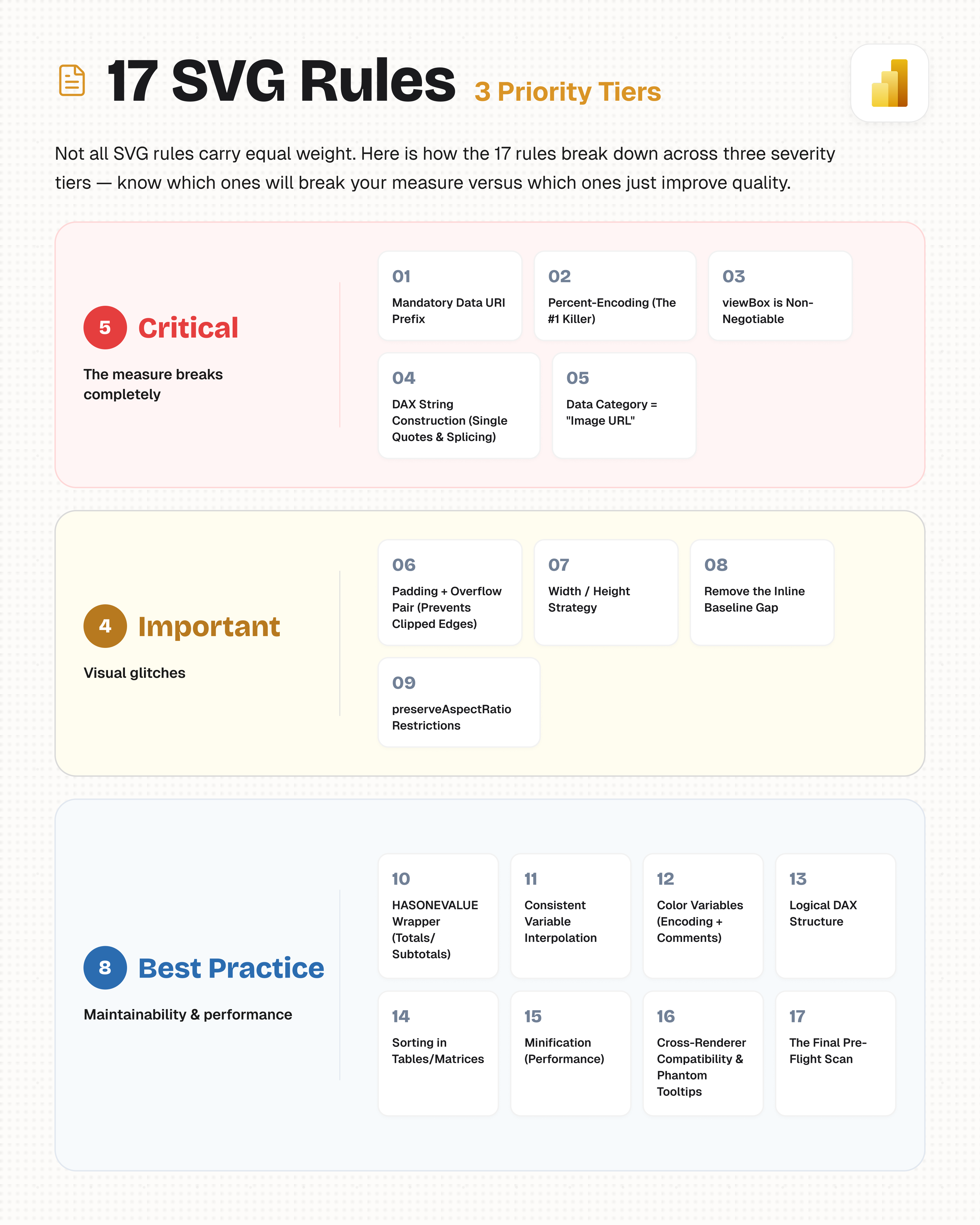
Critical (red) breaks the measure. Important (yellow) causes glitches. Best Practice (blue) ensures maintainability.
🔴 CRITICAL (Skip these = the measure breaks completely)
1. Mandatory Data URI Prefix
Every RETURN must start with "data:image/svg+xml;charset=utf-8,".
The trailing comma is non‑negotiable. Omit it and the image fails to decode.
2. Percent‑Encoding (The #1 Killer)
Encode every # as %23 and every % as %25 (including width="100%25" or height="72%25").
Some authors successfully leave # unencoded inside properly quoted SVG attributes, but %23 is the safer default for Power BI DAX SVG measures and avoids encoding-related edge cases.
One missed % can break the entire visual. Exception: using a CSS named color (blue, orange, steelblue) sidesteps the # entirely, at the cost of being limited to the ~140 CSS color names.
3. viewBox is Non‑Negotiable
Always declare viewBox="0 0 W H". Without it, the browser guesses the coordinate space and your drawing will scale unpredictably.
4. DAX String Construction (Single Quotes & Splicing)
Use single quotes for all SVG attributes: fill='%23000'.
Splice variables consistently: attr='" & VarName & "'.
Avoid: the legacy mess "&"'"&Var&"'"&". It is error‑prone and unreadable.
5. Data Category = “Image URL”
As covered above, this is mandatory in the Power BI model. Without it, you see raw text.
🟡 IMPORTANT (Skip these = visual glitches)
6. Padding + Overflow Pair (Prevents Clipped Edges)
Strongly recommended when strokes or markers sit on the edge: use viewBox="-2 -2 W+2 H+2" together with overflow="visible".
The padding covers the top and left edges; overflow="visible" is what protects the bottom, right, and any markers.
7. Width / Height Strategy
Default to width="100%25" and height="100%25" for Table, Matrix, Card, and Image visuals.
Exception (Azure Map markers): percentages don’t resolve meaningfully on a map, and Azure rasterizes the SVG into a bitmap. Use a fixed pixel size instead, 2‑3× larger than the intended display size, and scale down via the Format pane’s marker Size setting.
8. Remove the Inline Baseline Gap
Add display="block" to the root <svg> to eliminate the small baseline gap that inline elements reserve.
9. preserveAspectRatio Restrictions
Use preserveAspectRatio="none" ONLY for bars, lines, and progress tracks.
Never use it for icons, circles, maps, or text. It distorts them.
🔵 BEST PRACTICE (Maintainability & Performance)
10. HASONEVALUE Wrapper (Totals/Subtotals)
Wrap your RETURN to prevent broken images in aggregates:
IF(HASONEVALUE('Table'[Column]), <svg>, BLANK())
11. Consistent Variable Interpolation
Stick to one pattern everywhere: attr='" & VarName & "'.
Avoid mixing in the nested variant. It confuses both humans and AI tools.
12. Color Variables (Encoding + Comments)
Store every color as a VAR, encode it immediately (%23...), and add a comment for the colour name.
Example: VAR _FillColor = "%231F3A2E" -- Charcoal.
13. Logical DAX Structure
Order your measure strictly as:
Configuration (Inputs) → Calculations → Colors → Geometry (SVG fragments) → RETURN.
14. Sorting in Tables/Matrices
Add <desc>FORMAT([Value], "000000000000")</desc> as the first child after <svg> to enforce numeric sorting (works for non‑negative values; offset negatives first).
15. Minification (Performance & Practical Limits)
No XML prolog, no unused namespaces, remove unnecessary whitespace.
Minification isn’t just about performance: Power BI measures have a practical limit of around 32,000 characters, so keeping SVG markup compact also helps prevent large measures from becoming difficult or impossible to maintain.
Check for dead weight like a declared xmlns:xlink with no xlink:href anywhere.
16. Cross‑Renderer Compatibility & Phantom Tooltips
Avoid filters, embedded rasters, and foreignObject (unless tested everywhere).
🛠️ Phantom Tooltip Fix: if a tooltip persists after being disabled, adjust the “Image size” value in the Format pane to force a re‑render.
17. The Final Pre‑Flight Scan
Before publishing, manually check:
- URI prefix correct?
- Data Category = “Image URL”?
- All
#→%23? - All
%→ two hex digits (%25,%20, etc.)? - No unused namespaces?
Bonus: Axis Normalization for Data-Driven Charts
Every rule above is about whether your SVG renders correctly. This one is different: skip it and your SVG still renders as perfectly valid, error-free markup — it’s just visually meaningless, because nothing on the page is drawn to a comparable scale. That’s why it isn’t rule #18: it’s not a rendering failure, it’s a data-modeling decision, and unlike the 17 rules above, it doesn’t apply to every visual.
Does this apply to you?
- Yes, if your visual plots a value as a position or width along a scale — bar charts, gauges, linear progress tracks, sparklines. The bar’s length only means something if it’s measured against the same range as every other row’s bar.
- No, if your visual has a fixed, self-contained range that never depends on other rows — a 0–5 star rating, a single-value badge, a status icon, a fixed 0–100% progress ring. Nothing to normalize against.
The pattern, when it applies:
Calculate the axis min/max once, across the right scope — not per row — then use that shared range to position every element:
VAR _AxisMax =
    CALCULATE(
        MAXX( ALLSELECTED( 'Table'[Category] ), [Your Measure] ),
        REMOVEFILTERS( 'Table'[Category] )
    )
VAR _AxisMin =
    CALCULATE(
        MINX( ALLSELECTED( 'Table'[Category] ), [Your Measure] ),
        REMOVEFILTERS( 'Table'[Category] )
    )
ALLSELECTED keeps the range reacting to slicers/filters the user has applied, while REMOVEFILTERS on the category column specifically stops each row from filtering the range down to just itself — without that, every bar would always scale to exactly 100% of its own value, which defeats the entire point of a bar chart. Use _AxisMin/_AxisMax to convert each row’s actual value into a position or width within your viewBox, the same way you’d normalize any value into a 0–1 range before scaling it.
Get this wrong and the failure is silent — no error, no broken image, just bars that all look roughly the same length regardless of the real underlying difference between them. Worth testing by eye against the raw numbers, not just checking that the measure returns a valid image.
Skip the manual grind? Jump straight to Section 3. The AI prompt template applies all 17 rules automatically, so you can focus on the design, not the debugging.
3. The AI Prompt Template (Generate Bulletproof DAX)
3. The Power BI SVG Measures AI Prompt Template
One of the biggest challenges when starting with Power BI SVG measures is getting the DAX syntax right, especially the percent‑encoding and the data URI prefix.
I have been using this prompt template with ChatGPT, Claude, and other LLMs to generate production‑ready SVG measures. It bakes in every single one of the 17 rules above, plus a conditional check for axis normalization when the visual actually needs it.
How to use it:
- Copy the entire block below.
- Paste it into your favourite AI chat.
- Append a clear description of your visual (e.g., “A green checkmark for values > 100, red cross for values < 100, size 50x50, for a Table visual”).
- Run the output through the “Final Pre‑Flight Scan” from Section 2.
You are an experienced Power BI developer writing a DAX measure that renders as an inline SVG image.

Follow these rules strictly, regardless of what visual I ask you to build.

RULE 0 — MANDATORY PREFIX & POWER BI SETUP
- The DAX RETURN must start with: "data:image/svg+xml;charset=utf-8,". The trailing comma is critical.
- The measure MUST have its Data Category set to "Image URL" in the Power BI model.

RULE 1 — ENCODING
- Every '#' becomes '%23'. Every '%' becomes '%25' (including width="100%25" and "72%25").
- Scan the final string for every '%' and confirm it is followed by two hex digits.
- Alternative: CSS named colors (red, blue, orange, black, steelblue, etc.) need no encoding at all, since there's no '#' to escape. Fine for simple cases; use hex when a specific brand/theme color is required.

RULE 2 — DAX STRING CONSTRUCTION
- Use SINGLE QUOTES for every SVG attribute value (e.g., fill='%23000').
- Splice variables with: attr='" & VarName & "' (Close string, ampersand, variable, ampersand, reopen string).

RULE 3 — SIZING & VIEWBOX
- width="100%25" height="100%25" (unless fixed size explicitly requested).
- Always include viewBox. Add display="block".
- Given W x H, use: viewBox="-2 -2 W+2 H+2" overflow="visible" (together; the padding alone only covers the top/left edge).
- preserveAspectRatio="none" ONLY for bars/lines, never for icons/circles/text.

RULE 4 — LOGIC & COMPOSITION
- Order: Configuration → Calculations → Colors → Geometry → RETURN.
- Annotate color VARs with comments (e.g., "%23686868" -- Charcoal).
- Wrap RETURN in IF(HASONEVALUE(<column>), <svg>, BLANK()).
- For sorting, add <desc>FORMAT([Value], "000000000000")</desc> right after <svg>.
- Don't declare unused namespaces (e.g. xmlns:xlink with no xlink:href anywhere). Dead weight on every row.

RULE 5 — PERFORMANCE & COMPATIBILITY
- No XML prolog. No unused namespaces. Minify markup.
- Avoid filters, raster images, external refs, and foreignObject tricks (unless tested).
- Phantom Tooltip Fix: If a tooltip appears even after disabling it, adjust the 'Image size' in the Format pane to force a re-render.

RULE 6 — AXIS NORMALIZATION (conditional - only if the visual needs it)
- If the visual plots a value as a position or width along a shared scale (bar chart, gauge, linear progress track, sparkline), calculate the axis min/max ONCE across the full comparison scope before computing any position - e.g. CALCULATE(MAXX(ALLSELECTED(<category column>), <measure>), REMOVEFILTERS(<category column>)), and the equivalent MINX for the minimum. Use that shared range to convert each row's value into a position, not each row's own value in isolation.
- If the visual has a fixed, self-contained range that doesn't depend on other rows (a 0-5 star rating, a single-value badge, a fixed 0-100% ring), this does not apply - skip it.

DESIGN PHILOSOPHY
Prefer the easiest-to-maintain, least-likely-to-break implementation, not the shortest or cleverest.

Now build the following visual:

[DESCRIBE YOUR VISUAL HERE — chart type, measures/columns, colors, logic, target size/column]
4. Community Resources & Templates
4. Community Resources & Templates
If you want to skip the manual creation and learn from the best, here is a curated list of free SVG resources, template galleries, and tools from the Power BI community.
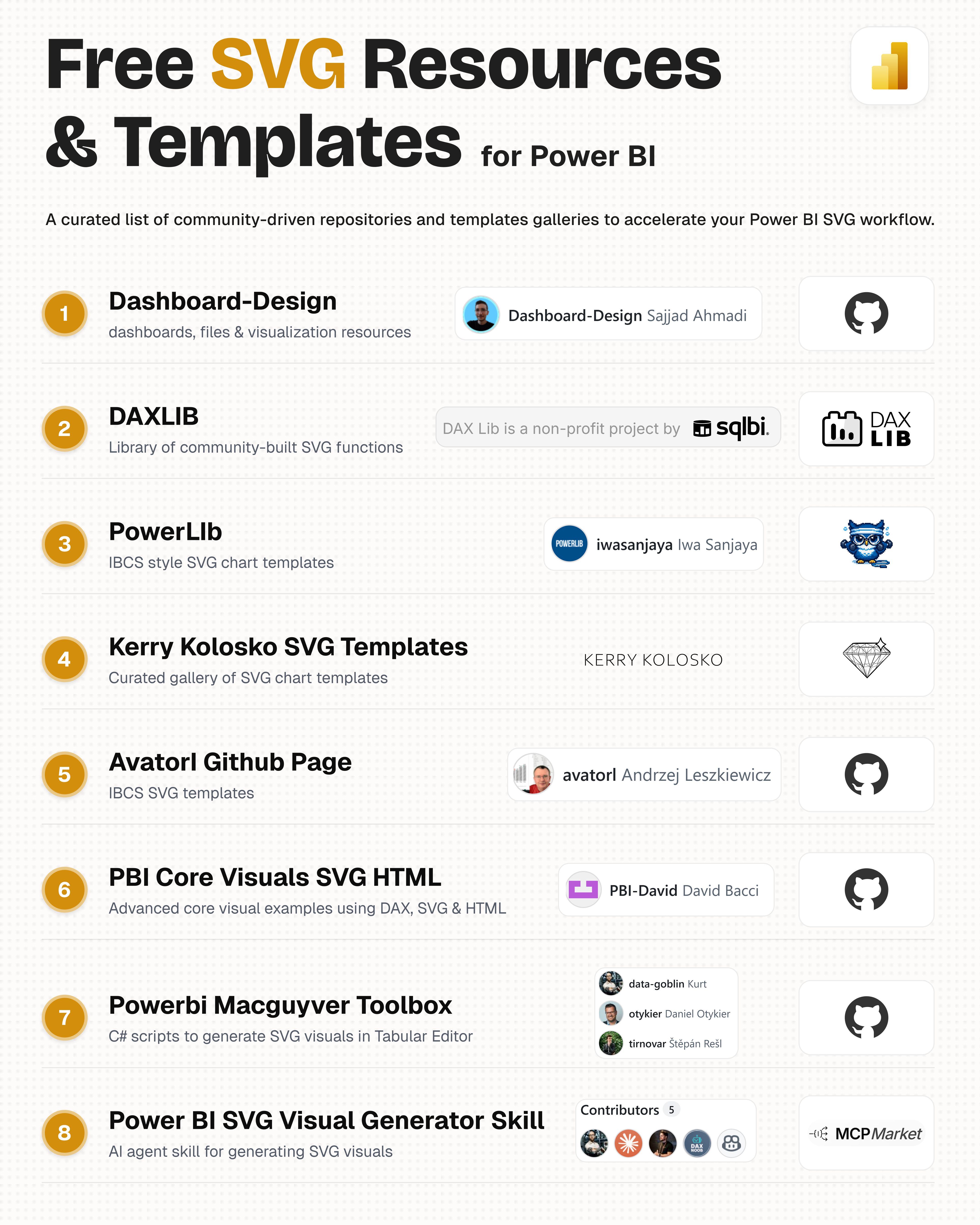
A curated list of community‑driven repositories, template galleries, and AI tools to accelerate your Power BI SVG workflow.
- Dashboard-Design (Sajjad Ahmadi) – Power BI dashboards, design files & visualization resources.
- DAXLIB (SQLBI) – UDF library with community‑built SVG functions.
- PowerLib (Iwa Sanjaya) – IBCS‑style SVG chart templates.
- Kerry Kolosko SVG Templates – Curated gallery of SVG chart templates.
- Avatorl Github Page (Andrzej Leszkiewicz) – IBCS and Deneb SVG templates.
- PBI Core Visuals SVG HTML (David Bacci) – Advanced core‑visual examples using DAX, SVG & HTML.
- Powerbi Macguyver Toolbox (Kurth Buhler,…) – C# scripts to generate SVG visuals in Tabular Editor.
- Power BI SVG Visual Generator Skill (Kurth Buhler,…) – AI agent skill for generating SVG visuals via DAX.
Download the Assets & PBIX Examples
All of the best practices, the prompt template, and a collection of ready‑to‑use SVG visual examples (including the 7 places) are available on my GitHub repository. Whether you are building your first SVG measure or looking to level up your dashboard design, these files will save you hours of trial and error.
GitHub Repository: Power BI Design Files – SVG Visuals
Final Thoughts
Power BI SVG measures are not a passing trend. They are a fundamental skill for any serious Power BI developer. With the 7 use cases, the 17 priority‑based rules, and the AI prompt template, you now have everything you need to go from broken text strings to bulletproof, production‑grade Power BI SVG measures.
If you found this useful, consider sharing it with a colleague or saving it for later. The AI prompt template alone is worth the read!

Comments
Share your take or ask a question below.